
a collection of notes on areas of personal interest
- Introduction
- Arabic / Islamic design
- Arabic / Islamic geometry 01
- Arabic / Islamic geometry 02
- Arabic / Islamic geometry 03
- Arabic / Islamic geometry 04
- Islamic architecture
- Islamic urban design 01
- Islamic urban design 02
- Islamic urban design 03
- Islamic urban design 04
- Islamic urban design 05
- Arabic / Islamic gardens
- Gulf architecture 01
- Gulf architecture 02
- Gulf architecture 03
- Gulf architecture 04
- Gulf architecture 05
- Gulf architecture 06
- Gulf architecture 07
- Gulf architecture 08
- Infrastructure development
- The building industry
- Environmental control
- Perception
- The household on its lot
- A new approach – conceptual
- A new approach – principles
- A new approach – details
- Al Salata al jadida
- Public housing
- Expatriate housing study
- Apartment housing
- Pressures for change
- The State’s administration
- Society 01
- Society 02
- Society 03
- Society 04
- Society 05
- Society 06
- History of the peninsula
- Geography
- Planning 01
- Planning 02
- Population
- Traditional boats
- Boat types
- Old Qatar 01
- Old Qatar 02
- Security
- Protection
- Design brief
- Design elements
- Building regulations
- Glossary
- Glossary addendum
- References
- References addendum
- Links to other sites
Signs and signing
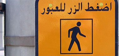
A generation ago there was little or no need for signing. But with the installation of an expanding road system and the growth of public and private facilities, there became an increasing need to convey information to the public through the medium of signing, both to identify, control and direct. I may write about the issue of signs and signing theory later but here I want to introduce signing with a simple issue related to the complexity of conceptual ideas.
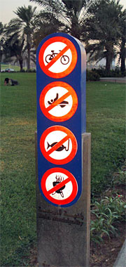
This photograph is of a Doha Municipality sign on which there are four signs or pictograms. There appears to be a universal understanding nowadays that a circular pictogram surrounded by a red line and with a diagonal red bar through it means that the activity depicted is forbidden. It is a good example of the infiltration of a standard through repetition and we can see it used internally as well as externally. We are so familiar with it that we no longer think twice about this instruction. This appears to be as true in the Arab world as it is in the West.
The pictograms are another issue, though. Difficulties with them arise mainly under two conditions:
- with a perceived need to produce a better or different version of an existing pictogram, and
- when there is found to be a requirement for a new injunction.
In the first case, international sports games are one area where new pictograms are commonly produced, usually as part of the design ethos for a particular event. Often these designs are innovative and attractive with considerable professional expertise being deployed as sports games attract good revenue streams and warrant expenditure on well co-ordinated advertising campaigns. However, there can be difficulties with cultural issues as well as with, in the case of sports, similar sports being illustrated and being not easily distinguishable.
In the case of a novel pictogram, the chief difficulty is producing signs which are not only legible but which can be readily understood by those likely to come in contact with them. Here there can be both cultural as well as familiarity problems.
Above and to the right there is a good example of this problem. The top three pictograms obviously relate to injunctions against, respectively, cycling, swimming and fishing, but the lowest pictogram is far less obvious. At first I thought it was a fly on its back – a symbol of death, and I wondered if it was an attempt to keep people off the grass because it had been treated with a poison. But now I suspect it is supposed to illustrate a barbeque, in which case it is an injunction against people using the area for barbequeing or, perhaps, picnics. You can see this may be a problem relating to culture, familiarity or poor design or, of course, a combination.

Working to Western designs and standards, a wide range of signing is now being installed. Here, for instance, are internal signs for, from left to right, women’s and men’s toilets, women’s and men’s prayer areas, and telephones. I hope I have the prayer signs the right way round, but you can see here one of the difficulties inherent in sign design – that of developing pictograms which can be readily understood. The sign for telephones is relatively easily understood as are the signs for women’s and men’s toilets – even though they illustrate people in Western dress. There is also an issue about the apparent location of women’s and men’s toilets in the same direction, but I shall try to deal with that issue elsewhere.
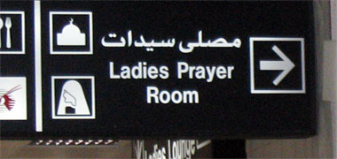
In this second photo there are again pictograms or signs for a mosque and a woman, apparently the sign for a women’s prayer area. Usually a pictogram is a single conceptual idea which represents an activity or function. With the need for separation of the sexes in Islamic countries, there is an obvious difficulty when the sexes are mixed but need to be directed to different physical locations. Here the direction is effected through the association of two pictograms, reinforced by the statement in Arabic and English musalla saidaat – Ladies Prayer Room. But, with the printed script, this is an example of three – or four if you include both languages – signs for a single function. Note also that the face of the woman in the pictogram is unmasked.
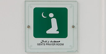
Here is a mens’ version of the above sign. While that is an element in a coordinated signing system for the airport, this is more in the nature of a generic sign that might be used anywhere. There are two interesting points to note here, apart from the use of the green colour. Firstly, although the sign marks the location of a prayer room, the Arabic refers to it as a mosque. Compare this with the sign above for women which, more correctly, describes the area as a prayer room. The other point to note is that the pictogram illustrates a person kneeling; obviously a symbol for prayer, the crescent moon further reinforcing the concept. Compare this again with the sign above for women where the indication of prayer is shown by pictograms of a mosque connoting the prayer function, and a woman’s head expressing the gender restriction.

This is an interesting sign to me as it has a special character to it which may not be understood by everybody. While the English element of the sign points the way to the ‘Business Class Lounge’, the Arabic version reads, more or less, ‘Men’s Business Class Lounge’. It’s a subtle way of dealing with a difficult problem in the Arab world, but I wonder what happens when a business woman turns up.

And here is another sign, this time a temporary one fixed to a door, which is unlikely to be encountered in the West. I don’t know the circumstances under which this was placed here, nor why the presence of men should be a problem; to the stranger this can only be guessed at. But when signs are encountered which are ambiguous or make a reader curious, they are not likely to be that effective. The Arabic doesn’t make it any more clear – ‘Here there are men on the inside’. Perhaps it is not a notice of prohibition as I have assumed…
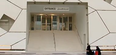
This photograph has been included for obvious reasons. One of the tenets of design generally, and architecture in particular, is that elements of the design – in this case, the building – should be legible or understandable. You would anticipate that a building with an opening at ground level and steps leading to doors would be readily comprehended as an entrance. I can only assume that this was a later addition to the building, and that there is some legislative reason for employing it. For whatever the reason is, it is embarrassing for a designer to see this on his building, and as far as I can see, unnecessary. For what it’s worth, neither the Roman nor Arabic lettering is of a quality to match the building.
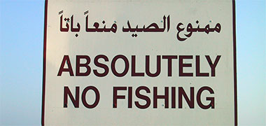
I must have mentioned this before but the quality of Roman lettering compared with Arabic really is noticeable, and not to the benefit of the Roman lettering. Here the Roman lettering shouts at the viewer, while the Arabic lettering is much smaller and quieter. You should be aware that using upper case or capital letters in Roman script is common for headlines, but lacks readability compared with lower case letters. With the increasing use of the Internet, people are becoming more aware that the use of capital letters is likened to shouting and is considered rude. Here it is meant to be authoritative, though this fails compared with the Arabic which might be considered more discursive. Note how much more legible the smaller Arabic lettering is than the Roman.
One of the conceptual difficulties with signing is in dealing with the urge many have to use signs when they are unnecessary or inappropriate. This sign, illustrating and stating ‘masjid’ immediately adjacent to a masjid, is a case in point.

Since some time around the tenth century, manaaraat came to be associated with masaajid, their original purpose being to provide an effective location from which the mu’adhin might call the faithful to prayer at a distance. Originally height created concern for privacy but, increasingly, the manaara has become the main feature by which masaajid can be identified and located. They are designed to stand out, aiding way-finding by establishing vertical points of interest within the urban fabric, while at the same time creating and reinforcing the urban character of the area in which they are found. There may be an argument for signing the name of an individual masjid, but not in the generic manner shown here.
The ability to identify a masjid is implicit in muslimeen who pray five times a day – as well as in others likely to be living in Qatar but of different faiths. The location of a sign adjacent to one, as shown above, illustrates a lack of understanding for the purpose of signs, as well as adding to the proliferation of street furniture which increasingly clutters our urban spaces.
Road signs
Road signage introduces different problems, requiring a structured and consistent approach to informing drivers and, to a lesser extent, pedestrians, of directions. Generally signage is considered to be necessary in illustrating directions for travel, but it is also important to establish where the viewer is located when viewing those directions. To state the obvious, it is necessary for way-finding, though is a formalised system of information and not the visual framework usually associated with way-finding.
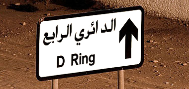
Road signs were probably the subject of the first sign design initiatives in Qatar. As I mentioned, there are a mixture of road sign designs in Qatar depending on a number of factors usually relating to when the programme was initiated. Doha is enclosed or served by a number of ring roads, the ‘D’ Ring Road being, essentially, the outer ring road. Here you see a standard notice pointing to it. Apart from the Arabic writing – which reads ‘Fourth Ring’ – it could easily be in the United Kingdom. It is a simple, legible, unambiguous sign.

The same goes for these street signs which are generally to be found within the internal road areas of towns. They number the municipality areas and give names and numbers to the streets. These, incidentally, have been determined by a formal Street Naming committee, an organisation brought into being by the need to create acceptable street names, particularly where there might be traditional claims or existing unfortunate names in certain areas. Traditionally, of course, many streets were named after individuals who lived or had business there, or were derived from the businesses or trades operating there, or related to geographical or tribal coincidences.
Unusually for signs, the type is white on dark blue or black which can create legibility problems. The Roman type face appears to be Arial rather than Helvetica or Grotesque, and the weight is the same for both white on black and black on white. Usually there should be a slightly heavier weight for white on black. Having said that, the signs and well designed and clear but it is interesting to note that the Arabic type face is clearer and, therefore, more easily read, than the Roman face. Nowadays, the Arabic face appears to be set smaller than the Roman equivalent.

Here are two signs, the first older than the second, and a little dirtier. The first is particularly interesting as it includes – at the centre, top – a small diagram illustrating the position of the zone ascribed to Najma, an old area of Doha, though no clue as to how it fits geometrically into the rest of the city. Top left and right are the numbers given to the zone in English and Arabic respectively and, in the centre given pride of place, the name of the area. Below it is a weaker typeface giving the name in English. Incidentally, I don’t recognise the typeface and have to say that the disbalanced uppercase ‘N’ suggests it may have been made up. It’s not any of the usual suspects – Helvetica, Arial, Univers, Folio, Grotesque, Akzidenz-Grotesk and the like. If anybody knows what it is, please let me know…

This is the form of the standard street sign used throughout the State, in this case for Jummaiz Street in the area adjacent to Najma in Doha. Interestingly, some of the diacritics have been added to the Arabic form of ‘Jummaiz’ to assure its pronunciation, though not all of them, nor for the word ‘shaar’a’ – street. The street reference number is given at the bottom right hand corner and the area or zone number is given bilingually in the rectangle on the left. The only criticism I have would be in the comparison between the straightforward way in which the Arabic name is given – ‘shaar’a al jummaiz’ – with that of the English name – ‘Al Jummaiz’ and the following ‘ST’ or Street located some distance away and linked with the street reference number. Why the latter is needed I don’t know, though there may be a reason connected with the co-ordination of facilities and utilities and, therefore, of use to those working on utilities in the area. Having said that, it’s a clear sign – and the English typeface appears to be Arial bold.

Road way-finding signs have now developed into a programme of large structures upon which are suspended highly visible bi-lingual signs, illuminated at night. The signage is legible, colour coded and follows Western standards of design and placement resulting in a strong international visual intervention. The supporting structures are simple but strongly modelled for structural reasons. While there is a need for continuity of design in signage with regard to moving between countries, this view of the Rayyan Road might be almost anywhere and invites the question as to whether there should be more of a local character to the design of roads and their accompanying signage.
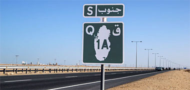
The main roads in Qatar have a logical numbering system given them and, like most signs, give information in both Arabic and English – whether in the form of words or initial letters. Here is a sign informing drivers on which road they are travelling, and in which direction. The road is the chief road going up the peninsula, the 1A, with the letter ‘Q’ and Arabic letter ‘qaf’, together with an outline map of the country to identify it being Qatar. Above it is the letter ‘S’ to signify travelling south, together with the full word janoob written in Arabic. It is notable that there is significantly more information than is required by a driver.

This sign informs drivers of the road to take when exiting an approaching roundabout. Associated with the destination lettering are distances in black set against an orange background on the green ground of the sign. They are not really legible and need to be reconsidered as drivers should not have to spend time trying to read them when their concentration needs to be on the road ahead of them.

Here is another road sign cautioning drivers against approaching road humps. While it is large, well positioned and should do the job for which it was designed, its design appears weak when compared with the standard ‘D’ Ring Road sign illustrated above. A heavier type face would improve it, but I also think the leading of both Arabic and Roman scripts should be reduced, creating a little more space between the three elements of the sign – the top symbol, the Arabic and the Roman scripts.
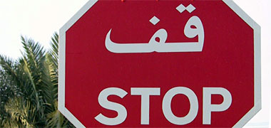
Generally speaking road signs are easily understood and have their design roots in either the United Kingdom or the United States. Here the Arabic lettering takes precedence over the Roman letters which are in upper-case or capital letters, in theory more difficult to read than lower-case lettering. I believe the rationale is that ‘STOP’ has a more imperative tone to it than ‘stop’, or even ‘Stop’. Incidentally, notice how the capital letters in ‘Caution Humps’ above don’t look quite right in context.
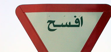
This sign is only in Arabic and reads ifsah – ‘yield’ or ‘give way’. I don’t know why it is only written in Arabic, though I have heard it argued that signs should be written only in Arabic and that it is up to foreigners to learn what they mean. I know there has been discussion on this subject and assume that no decision has yet been made as there is still a mixture of Arabic and English, and Arabic only.

Here is another example of an Arabic-only sign. It will be readily understood by most people as a countdown sign to a roundabout or junction exit. In this case the three bars represent three hundred metres to a roundabout, and this is also stated in Arabic between the bars and the roundabout sign at the top. It is a clear, legible and understandable sign, though I do have reservations about the size of the Arabic font used.
Incidentally, on a related issue, I have written elsewhere about the concepts relating to perception in the Arabic world and wonder why the sign wasn’t mirrored for use in an Arabic-speaking country.
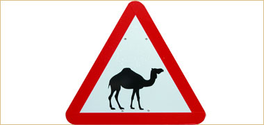
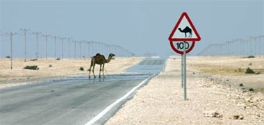
There are also signs that have been created for situations that are to be found only in Qatar or, perhaps more accurately, in and around the region. An unfamiliar one to Westerners, but a necessary and obvious one for a country which has few fences or compartmentation in rural areas, is a warning to be aware of the potential danger posed by camels. Westerners will be aware of similar signs bearing images of deer, sheep and other animals in their own countries, so the system is immediately recognisable to them.
Here you see a camel wandering across a country road. Camels can certainly be a danger to drivers if struck by cars as their high body tends to collapse on the vehicle’s cabin, crushing the driver rather than being pushed aside at a lower level as might, for instance, a sheep. Of course, it doesn’t do the camel any good either… But the loss of an animal to its owner can be a serious setback and one which will require considerable negotiation to compensate the owner for its loss. In these discussions there are likely to be more variables than with an animal such as a sheep where its intrinsic value is more accurately known. Camels have value in many ways to badu, but they also have more subtle value in their being one of the traditional supports to this way of life. Camels which are used for racing can be extremely valuable.
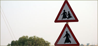
This sign is also unusual, but for a different reason. The two signs represent, below, a man – which I assume is intended to include women – and, above, children. Using a single, male figure is reasonable shorthand for people in general, and the use of children is also a good idea where there is a specific possibility of children running into the road. I don’t recall seeing these two signs displayed together before but, if there’s a good case for it in the specific location, then it is a reasonable solution.
Having said that it has to be noted that there are moves in the West to reduce the number of signs which are accumulating on our roadsides, as well as standardise their design. Compare the foregoing with the next photograph.

It seems that, in Qatar, there is an increasing tendency to allow a degree of flexibility in the design of signs. Here is a road-side sign that appears to combine the information contained in the two signs above, apparently illustrating a pictogram for an adult and child. It is an extremely stylised pictogram, almost a caricature. There has to be a question as to whether or not it is an improvement over a more accurate depiction of an adult and child. Seen at a distance it is certainly not as clear as those figures in the photograph above but, bearing in mind that it is a road-side sign, it is still likely to be understood, albeit more slowly than a more regular sign. This is counter-intuitive, and not what you would anticipate from a developing strategy for signing.

Compare this sign with the three above. Pedestrian road crossings are found all over the world. In Qatar the pictogram used to warn drivers of them sits on a sign that is common to the United States and is a representation of the striped pavement crossing with the outline of a male figure wearing Arab dress walking across it. It is different conceptually from that used in other countries, but is readily understandable in Qatar.
The difficulty with pictograms is that they may not be immediately recognisable by either nationals or foreigners. Here there is a case for using internationally recognised signage in order to avoid misunderstandings or lack of understanding.


However, increasingly, signs are being introduced which, with the best of intentions, might be confused with ordinary road signs. They are obviously road safety signs but have at least two curious features. Here are two of these signs, dramatically suggesting the loss felt by those who have a loved one taken from them; in the first case a brother – which might be meant figuratively or literally – or in the second, a father. Interestingly it is male and not family focussed as it appears to be aimed at possible victims and the concern of potentially bereaved male friends and family left behind.
The signs themselves are more complex than standard road signs but, despite their different shape and the lack of legibility other than at relatively close distances – and not at driving speeds – they might be thought to be road signs as they are attached to a road-side pole.
A third feature of the signs is the use of lettering in perspective. While I can see no reason for it, the lower photograph has the English type in perspective, but not the Arabic.
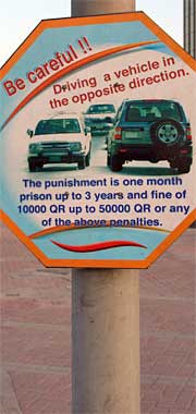
Here is a traffic sign which bears a far more serious message. Unfortunately I don’t know the exact position of the sign in relation to traffic but my guess is that it is sited at one end of a one-way system or in a situation where, obviously, driving may be a hazard to other drivers.
My first thought is that there are an established range of traffic signs which cover such driving conditions, though admittedly not the penalty. Such signs are designed to be seen by drivers some distance from where the hazard is likely to apply. However, here it is obvious that there is no chance that a driver would be able to read it, and that it is more likely to be designed for a pedestrian to read – something which seems to be counter-intuitive when it is necessary for the sign to be read by a driver.
There are three other issues. The first is that it is written only in English and not in Arabic. This may be thought unfair by expatriates though may reflect a situation where there are more non-Arabic speakers driving. Secondly, the use of English is not too clear, though I have to admit the intent is evident. Thirdly, from a design point of view, the sign is busy with the lettering in two different colours, three different sizes and angles, and has the lettering conflicting with the swash at the bottom of the sign.
Curiously, the effect of putting so much information on the sign tends to work against the message stating the severe penalty for a possible infraction. It is generally understood that a clear sign – preferably one based on international standards – would be more authoritative than a small, over-designed, multi-coloured sign.
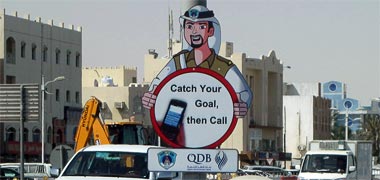
But it is not only the difficulties arising from having too much information on a sign that can create difficulties. One of a number of similar sponsored signs, this bears a poorly translated message in English which means, at a guess, ‘Don’t use your mobile until you are at your destination’. Taken in conjunction with others, it probably plays on the connection with family to make its point. As has been mentioned elsewhere, when a message is not clear, the brain takes time to process its meaning and, if you are driving, this may well take your mind away from the business of driving long enough to cause an accident. However, it is probable that signs of this size are designs for pedestrians to read – which begs the question: is it a warning for pedestrians or drivers?
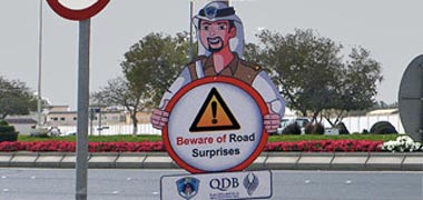

Here is another example from what appears to be the same series of information signs, apparently funded by the Qatar Development Bank whose advertisement sits below it. Again, the sign both gives an unclear message as well as having two other issues relating to its design. The exclamation mark on a yellow background within the triangle is the international sign for warning of danger and normally would be seen by itself in a single sign similar to the ‘Stop’ sign seen on the wider photograph below from which the upper illustration is taken. Reducing the size of the warning element and confusing it with the cartoon framework diminishes its importance – a conflict with its message. The second issue is the colouring of the words ‘Beware of’ in red, another unnecessary aspect of this signing. A further issue can be seen in the lower photograph where there are a number of signs grouped at this road junction, perhaps more than necessary, and certainly at least one which would be better located some way away from the junction – that informs lorries wishing to join the road ahead that, having reached it, this is not permitted.
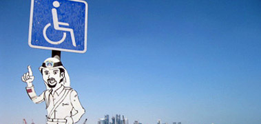
This sign, that above, and others on this page, appear to illustrate an approach by the police to complement international road signs with additional elements that may be thought to create a more friendly character to the signage. There is no clear evidence that this approach works, though there is a general principle governing road signage suggesting that signs are most effective when giving clear and unambiguous information, when they do not conflict with other information placed nearby, and are not agglomerated. Having said that there is a general use in Qatar of cartoon characters supporting information given to the public. While this may be sensible for general instruction, particularly in explaining documents or processes, it may be more problematic when used on traffic signage. By extension, it might be thought that using cartoon figures may diminish the power of a regulatory sign, undermining its authority.

The issue of legibility has been mentioned a number of times but here is a good example of confusion that has gone into the placing of a sign. The top sign is an instruction to give way. It is clear, unambiguous and will be understood by all drivers. The sign below it has a semi-authoritative character to it. It is a warning and again will have been seen, understood and, hopefully, borne in mind by drivers. But the third sign, added below it, is completely unreadable from a vehicle, particularly one in motion. Attempting to read it while driving is likely to be dangerous; it really has no place on a traffic sign, whatever it says.
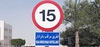
While the above signs can be confusing, here is a good example of the difficulties experienced when the writing on an important sign is illegible at the required reading distance, particularly bearing in mind that the driver will be moving. Although it could be better spaced, the Arabic version is considerably easier to read, consisting of three words. The transliteration of it into English is relatively accurate but, being longer, a condensed font has been used, creating a block of text that is difficult to read. A better approach would have been to use a simpler English phrase selected as being more easily read while containing the same warning.
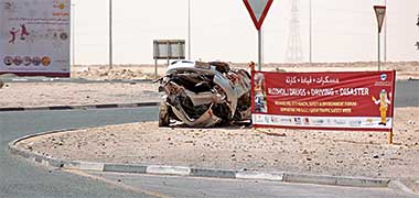
This crashed car and the message accompanying it were placed here in support of Qatar Traffic Safety Week, a time when similar advertising is used around the peninsula, this example being in Umm Said where there can be a considerable number of heavy vehicles using the road system. Crashed cars are a common sight, but their use here is designed as a warning to make people think about their driving though, in this example, the crashed car is associated with a warning not to take drugs or alcohol and drive. Police and traffic engineers are divided on the way this type of campaign is likely to work. The message can be powerful, but the placing of the car and sign may not be well sited where those on the road are maneuvering their own cars at the junction. Too much information is combined in the words on the sign and the desire to look at what has happened to the car. There are also arguments relating to the need to teach safe driving rather than just give warnings. There are certainly many drivers on the road who believe themselves safe, but may not be. The truth appears to be that crashes tend to be caused by a combination of poor skills together with lack of attention and a variety of inhibitors such as drugs and alcohol. Being aware of danger is not the same thing as having the skills to drive safely.
Other signs

Compare the standard and non-standard road signs illustrated further up the page, which are obviously produced professionally for one of the main government ministries, with this example made by or for one of the local government authorities. It illustrates four issues with signing which I think are important to consider in order that signs can be understood to be fit for purpose:
- legibility,
- translation,
- graphic design, and
- correct font use.
Legibility can be a problem if the type face and design is not considered for the location in which a sign is to be placed. Essentially the type face should be easily read and designed for the distance at which it is to be read. It may seem obvious but many signs seem to be designed without this latter consideration. Here, the Roman type face appears to be bold and condensed, both reducing legibility. Making the sign a little more confused is the relationship with the Roman message and the ‘With compliments of…’ line below it.
It may seem a little unfair to criticise the graphic design of the sign shown above. In theory the design is sensible. It sets out to balance Arabic on the right and Roman on the left, separated by a version of the State seal. But visually, it is disbalanced. The Roman and Arabic scripts don’t match in terms of their visual weight, the two scripts begin too close to the outer edges of the sign, the Arabic script actually touches the central badge and the leading – pronounced ‘ledding’, the distance between the Roman lines – is uneven making it more difficult to distinguish letters. Of the two scripts, the Arabic is much better set out.
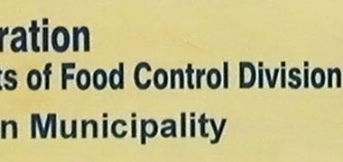
Here you can see a detail of this latter problem. The letters require space around them so that their shape, and the shape of the words they form, can be easily distinguished and, therefore, readily understood. But the top line crowds the line below it, reducing legibility and looking amateurish. In addition there is a curious use of type faces. The last line is set in Arial, an impoverished form of Helvetica but the top two lines appear to be a mixture of Arial which you can identify by the letter ‘a’, and Helvetica which can be identified by the top shape of the letter ‘t’ and the capital ‘C’. I assume this is due to unfamiliarity with Roman scripts by the sign-writer or designer.

This detail of the Arabic message is made to the same scale as the Roman side of the sign shown in the photograph above. As a Westerner it is noticeable to me that Arabic scripts tend to look smaller than their Roman counterparts, but this looks significantly smaller and out of balance. So far I have not been able to find any literature dealing with relative legibility of Roman and Arabic type faces. I wonder if it is a consequence of Arabs subconsciously using a larger Roman face in order to be able to deal with its unfamiliarity.

I don’t know why it was that the State seal hasn’t been designed or printed correctly as there are enough examples of it around to copy and get right, but it is unfortunate. The central geometry of ‘Rayyan Municipality’ is an obvious problem, and so is the type face for the Roman ‘State of Qatar’ which has played its part in diminishing the quality of the sign. These are both relatively easy to deal with.
Translation must also be a serious consideration. Many translated signs in the Arab and other non-Western worlds look strange to Westerners due to the vagaries of translation. Sometimes they can appear amusing; sometimes confusing. In the world of translating the rule is that the person who translates should be a natural speaker of the language into which the text or spoken world is being translated. At the very least, when a sign is being made in, say, English, it should be reasonable to ask that it be shown to a native English speaker in order that it is sensible, means what is intended, uses idiomatic or standard phrases, and is immediately understood.


Both of these examples would have benefited from such a proofing. The seat belt sign may just be a printer’s typographical mistake – a ‘typo’ in the trade – and I have an aversion to split infinitives, but the second notice from a dumpster has three problems. First there is the issue of the two mis-spelled words which appear to spring from a real misunderstanding of English. It is not just a case of being unable to write words heard but not read – the ‘ough’ letters in English having a wide variety of pronunciations – but also of confusing ‘o’ and ‘oo’. Secondly there is the separation of the two pairs of lines which tend to be perceived as two different signs and not as the continuous sentence intended. The third issue is the typeface used. This appears to be ‘Broadway’ and is not a sign which is readily legible due to the exaggeration of its strokes. Ironically, the fact that it produces an amusing sign makes it memorable and, perhaps, it can be argued more effective, but that really is debatable.

There are a number of problems with this sign. Starting with the English warning, there is the addition of an unnecessary apostrophe at the end of ‘jetski’, making it possessive which, of course, it’s not. I admit that this is a very common mistake, even in the naturally English-speaking world, but in Qatar it is even more important that words should be spelled correctly where many different nationalities may be reading the English rather than the Arabic. Using upper case also makes signs more difficult to read, as has been mentioned elsewhere, and adding a forward slash between the two words, ‘boats’ and ‘jetski’s’, makes this problem worse. There really needs to be a bit more space between the words and the slash to separate and aid legibility.
Compared with the English, the Arabic warning makes more sense and looks better at first glance. However, it is difficult to be sure why the Arabic of this sign is wrong – whether it is due to its manufacture, or if somebody has altered it – but the missing diacritics make it a little difficult to read. The diacritic signs that should appear above letters in each of the three words have been removed creating a less legible sign. A rough translation of the Arabic would be ‘the use of boats is forbidden’.
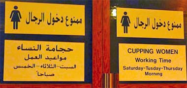
This photograph is of signs on a pair of doors in Suq Waqf. There are three or four reasons for its being here. Firstly, there are too many notices, there is repetition and the notices are too large. Secondly, there are two notices, both in Arabic only, stating that access is forbidden to men. There is no sense in repetition and the ideograph of a woman is not necessarily enough to warn men off. Finally the translation and spelling of the notice in English are not as good as they might be. While translation is often a matter of considerable debate, there is no real excuse for misspelling.
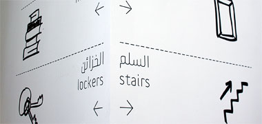
By contrast, these three photographs were taken in the Mathaf, the Arab Museum of Modern Art, which is situated in a converted School near to Education City. They illustrate something of the corporate style of the Mathaf, particularly in the use of pictograms and a lightweight style of typeface selection with both Arabic and English fonts having a similarity in their thin weight. From a Western perspective, the style is attractive, being light and easily read at the distances they will be encountered, and readily understood. However, although the illustrative style has resonance with the traditions of Arab cartoons, there is some ambiguity in their meanings. Pictograms, while designed to facilitate comprehension, can have the opposite effect.
For instance, the words ‘stairs’ and ‘lockers’ are direct translations of sallam and khazaa’n and refer to functional and familiar building elements. The pictogram for the stairs with its arrow might be readily understood, but the key for the lockers requires a bit more understanding. Yet the words ma’aaridth and maktaba – out of frame above – and makan refer to the galleries, research library and café respectively, none of the words being an accurate reflection of those building functions.

The use of an informal style of illustration for the signs seems well suited to the character for a museum of modern art. In the photograph above the pictograms for the research library, galleries, stairs and lockers are given by, respectively, a pile of books, a picture frame, ascending zig-zag with arrow and a key and may seem well enough suited to their meaning but, in this photograph there is ambiguity. The word ‘makan’ has the connotation of a place, but associated with an illustration of a group of men and women, it is not immediately obvious that this refers to the Mathaf’s café. Additionally it might be inferred that children are not welcomed.
Incidentally, the word makan is written in Arabic with a long second vowel and should, properly be transliterated in English as makaan. This is also the case for the following Arabic word, ‘manara’ again, properly ‘manaara’. This is a common problem with transliterating and one that gives rise to considerable disagreements.

The word manara has its origins in the name for a guiding light in the sense of a beacon, and is associated with the meaning both of a lighthouse – which is a warning device – or the tower or minaret of a mosque – which is an attracting or broadcasting device – though they may both be considered to guide people in a wider sense. In the latter use there is a relevance to it being the name given to the educational wing of the Mathaf where knowledge and light may be considered synonymous or, perhaps more accurately, where light can be cast metaphorically to illuminate and encourage knowledge. Its representation with a lightbulb is not uncommon in the Arab and Western shorthand of cartoons, but not quite in this context.
The main issue noted above is not to do with translation but the effect of naming a function, usually for branding or marketing purposes. Many buildings have named functional spaces. In the case of the Mathaf, the café and research library are named ‘makan’ and ‘manara’ respectively. These latter two functional words do not describe the function of the spaces, and this is compounded by associating a pictogram with the name which introduces another level of understanding or meaning. It is a common problem and one that designers need to consider carefully with a language that has such a cultural depth as Arabic.
There is a final comment to make on an issue that seems unusual. With both the words ‘manara’ and ‘makan’ you will see that the Arabic is aligned left whereas, being read from the right, the Arabic should be aligned right. Note in the first photograph both the English and Arabic appear to have been aligned with respect to the corner – a graphic, rather than a linguistic decision.
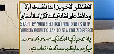
Here is a memorable sign, but for different reasons. It may be argued that signs such as this are not only memorable, but also effective as they certainly make you work to read them and understand their message. However, it is also possible that, for this very reason, there are many whose natural language is not one of the three used on the sign, who will fail to understand what is meant. As I have written about elsewhere with regard to communication between servants and Qatari children, poor use of language contributes to a spiral down of that language and its comprehension.
The sign has been hand-lettered, but none of the different languages’ lettering is well-selected, formed or balanced. Again, the English statement would have benefited from a native English speaker translating or putting the message into a more easily comprehensible form.

This sign has been included for a number of reasons. One problem with signs is is establishing the amount of lettering and its relationship both with the board on which it is printed as well as the amount of white space surrounding it. Although it seems counter-intuitive, the lettering on this sign would have benefited from being smaller. Red for danger is a standard metaphor and, on a white ground, works well though would have shown up better with more white showing around it. The use of capital letters works for a small number of words, but having a part of the letters obscured decreases the potential for comprehension. Lower case lettering would have improved legibility.
There are two other issues on this sign. Firstly, it is unnecessary to pay too much attention to grammar: the colon is not needed after ‘danger’. Secondly, the old problem of translation. The standard phrase is usually ‘Erection in progress’ rather than ‘Erection going on’. Although the latter is shorter, it is preferable to use the correct phrase rather than rely on a form that may not be understood by all.
It may seem unfair to pick on what might be thought to be small errors such as spelling and design due in the main with the former, to unfamiliarity with the English language. After all, in many countries natural language speakers produce signs with errors in them. Some are typos, but many are due to poor education. In a country with a wide diversity of natural languages it is important that unfamiliar languages which people have to confront in their day to day business should be accurate in order to be easily understood, avoid ambiguity and, sometimes, legal consequences.
The design issues are often just as necessary to understand. They need to have a similar degree of attention paid to them, the lettering and design of signs being properly integrated.

Here there are a number of problems, perhaps the main one being that there are too many warning notices on this part of a building site. In addition to the large chevron sign they read, from right to left, ‘Think family, think safety’, ‘Caution slippery surfaces’, ‘Your family is waiting for you’, ‘Danger blind curve’ and ‘Danger deep excavation’ – all in capital letters. But there are a number of other issues. People will not read too many signs, particularly when the signs are not in their native language. Using different sizes of lettering makes little sense and this problem is aggravated by the use of a variety of irregular font forms ranging from narrow through wide to decorated and, in two cases, adding graphic arrows to further confuse the messages.
But there appear to be two cultural issues as well. The first relates to the growing problems associated with Health and Safety regulations all over the world. Building sites are dangerous places where safety needs to be improved and maintained. But increasingly this is seen to be effected by using notices in place of sound physical methods, in this way believing the operators will be indemnified in case of accidents. The emphasis should, of course, be on the former rather than the latter.

The other issue has to do with two of these signs, those relating safety to family. This site has a contractor from the Far East, so I assume that the workforce has a cultural response to these notices that might be different from those in the West. But the theme is also one that is found in Qatar, particularly related to road signs. Whether the association of driving slowly in order to get home to your family is similar in terms of behaving safely on a building site, it is difficult to tell. However, the workforce will be expatriates, so it may well be that reminding them of home will be useful. How they will be able to relate this to the variety of issues revolving around site safety, is very difficult to tell.

Sometimes there is little need to use lettering. In fact a sign with no lettering that is readily understood will always be preferable. Here somebody has designed a sign to warn against access to the beach. The white circle with the red outline and diagonal line serve to create a warning, but the black hand and pictogram of a face with mouth open, apparently shouting, go further in making the message stronger. However, it does not look like an official sign and, as such, is unlikely to have the power to stop those with the desire to access the beach.

There is a strong tradition in Qatar, as in many parts of the world, for there to be graphic signs produced in order that those who have limited or no reading skills can understand them. Ideographs are a common form on direction and information signs, but for many years there have been designs that personalise such information. In the case of this sign, the concept of dentistry has been illustrated in a particularly artistic manner and is a notable and attractive addition to the streetscape.
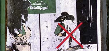
In a similar manner there is also a tradition of cartoons and caricature in the Arab world. This second photograph is of a poster for the Municipality Cleanliness Week and is interesting in its portrayal of the woman as well as its suggestion that people throw their rubbish on the streets. This was rarely the case in the Qatari parts of Doha where the external areas outside buildings were kept clean in conformance with Islamic practice. The style of the cartoon is to be found in northern Arab countries such as Egypt where there is a long tradition of this type of work.
Advertising

But while the two signs above are based on stylisation and caricature, there are also signs that are more recognisably Western in the manner in which they attempt to draw the viewer in. The increasing wealth of the country was reflected in its inhabitants having money to spend on the consumer durables needed to furnish their new and larger homes. Merchants vied with each other to obtain the custom of the burgeoning consumer base. One of the chief difficulties for them was that there was, as yet, little opportunity to advertise other than in the local newspapers and magazines. There was, however, an established group of sign-writers capable of moving from painting signs for merchants and contractors, and putting their talents into this new field of activity.
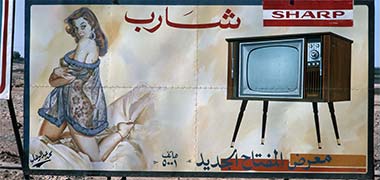
In those heady, early days of advertising, some of the signs were considered to be improper and it was not long before those depicting more sensual subjects were banned. This, and the photograph above illustrate typical roadside advertisements from the early 1970s, that above being relatively innocuous. But this large roadside advertisement for Sharp televisions drew considerable attention from passing motorists in 1975, and probably was significant in curtailing this character of advertisement. It was a surprising addition to the roadside in an Islamic state. It is more sexually explicit than many of the illustrations to be found in the press at that time. Like many of the signs in the 1970s, it is hand-drawn by an artist who, in common practice, signs his name to his work.

As a more traditional sign, this photograph, taken in 1972, advertised a local trader and also appears on another page where it is paired with a photograph of the building it illustrates. These early boards were painted by illustrators, usually from the Indian sub-continent, and exhibit a lively naïvety which has been lost by modern advertisements. There used to be many such boards around Doha illustrating dentists, butchers, bookshops and the like and lent much to the urban scene in their individuality. While this may be thought of as a commercial sign, it vividly advertises the nature of the business. Compare this with the character of those that follow.
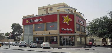
We are all affected by the plethora of signs located for us to encounter as we move in and around buildings. In fact, buildings themselves are often advertisements. Advertising is one of the most important areas of expenditure by those wishing to move us towards buying their products. Without advertising, their goods and services do not sell. In many parts of the world considerable efforts are being made to regulate advertisements, but it is thought by many to be a losing battle. The need to impose corporate identities is reflected in the massive outlays companies make to reach their public and, as here, by the scale of advertisement used to attract customers.
I have chosen the illustration, above, for no other reason than that there is a degree of integration between the corporate imaging and advertisement with the building. In this sense it might be considered well designed. It belongs to one of many large Western companies who are spending great sums to spread their identities across the world. Here there is a small effort made to cater for an Arabic or Muslim population by the incorporation of their name in Arabic on the right hand flank wall, but it is interesting to see that their off-balance star is used in its Western form, and does not cater for the subtle influences inferred by those reading from right to left.
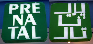
These two signs advertise a store named, in English, ‘Prenatal’ or, perhaps ‘Prénatal’ suggesting a French origin. But they are displayed here for at least two reasons relating to cultural sensitivity. The first is the unattractive Roman type face selected with its lack of balance within each letter and, perhaps, the unfortunate use of upper case rather than lower case, the latter of which would have better matched the Arabic form. I have noted elsewhere the psychological effect of using capital letters, which has the effect of shouting. Not only is the ‘é’ difficult to read, but cutting the single word into three and balancing each group vertically neither aids legibility nor creates a useful logo.
Perhaps worse than this is the way in which the Arabic has been treated. Again three groups have been formed reading ‘priy’, ‘naa’, ‘taal’ corresponding to the Roman lettering, ‘pray’, ‘na’, ‘taal’ if read by a French reader, or ‘pri’, ‘nay’, ‘tal’ if by an English reader. Bear in mind too that there is no ‘p’ in Arabic, so the Persian form is used, the three diacritics below the letterform being uncomfortably positioned as is that above the ‘n’ when compared with the others. Additionally, some would argue that there really should be a junction between the ‘y’ and ‘n’ of the first two groups. This may appear to be pedantic – and there are many examples of Arabic script being broken to good effect – but this is not a good example and does little to benefit the urban setting within which it was found.
Having said that, it is not difficult to understand how the signs came about: the lettering was required within a square format rather than within a rectangular shape, the latter of which would have been both easier and more suitable.
What this pair of signs really illustrate is the difficulty of creating a similarity of identities in two different language letterforms.

Here is another sign which has rather surprised me. This company has one of the most widely known international logos, one which is particularly known for the graphic design skill with which a white arrow has been incorporated as the white space between its last two Roman letters, the ‘E’ and ‘x’, respectively upper and lower case. Here, on a passing van, is the Arabic form of the name, created in a much weaker design. Reading, more or less in English, ‘feedeeks’, the close junction of the blue ‘d’ and following red ‘y’ is not as well defined as it is in the Roman version where the ‘d’ and ‘E’ are, respectively, lower and upper case creating a better junction than here in Arabic which has only a single case. Perhaps more seriously, the famous white arrow has been imposed upon the final ‘s’ as it was obviously impossible to replicate its Roman form. While the weight of the Arabic lettering is similar to its Roman form, the relative weights of the Arabic letters seem to be out of balance with each other, the ‘k’, particularly, appearing weak. The transliterated word ‘Express’ also suffers from its reading as ‘iksbrees’
The logo illustrates an interesting point with regard to the use of Arabic scripts. These have very firm rules for their organisation, sizing and relative relationships – though artistic interpretations are not unusual. However, the development of transliterated forms in Arabic introduces a range of cultural issues. These include, but are not limited to, pronunciation and Arabic letter forms, and will be discussed elsewhere.
more to be written…
Street furniture

There are a significant number of items scattered round our streets all over the world. Here we have a letter box belonging to the General Postal Corporation of Qatar, painted yellow in a similar manner to boxes in Germany and elsewhere, a colour which can be readily seen. I note that the base plate is slightly larger than the step it’s attached to, and that there are no times of collection on it. Otherwise it’s an interesting design object with quite a bit of character to it. I wonder if I should expect this kind of object to have more relevance to Qatar and Islamic design. I shall have to think about this …
Street furniture is the collective name for a large selection of items designated to perform or be used for a variety of functions. These might be considered as related to:
- necessary functions, such as street lights and traffic signals,
- protective, such as bollards,
- advisory or way-finding, such as street signs, bus and taxi stop signs,
- functional, such as post boxes, waste baskets, public telephones, public lavatories and drinking fountains,
- decorative, such as planters and hanging baskets,
- recreational, such as seating, benches and shelters,
- operational, such as boxes and fixtures used by the municipality and government departments needing to have access to water points, communication systems and the like, and
- regulatory, such as speed cameras.
Don’t take this list as exhaustive as I’m sure there are other examples as well as other ways of organising the list.
As a general rule items of street furniture are not designed for specific locations but as stand-alone objects capable of being placed in any location where their presence is necessary. As each item is owned by a specific organisation and has a different, particular function, they are not coordinated and their eventual positioning appears random.

Here, for an example of the kind of street furniture we take for granted every day, is a street corner outside a new mosque in Doha. There is, from the right, a concrete bollard, street lamp, telephone kiosk, a State utility box on a plinth lurking behind which is an emergency traffic cone, and a drinking fountain for which somebody has added a concrete block to provide a step for children requiring a drink. There is also an air-conditioning screen, though some would not agree that it can be thought of as street furniture, but a part of the mosque. The row of holes, incidentally, I believe will illuminate and vent a washing facility for the mosque. However, the point of listing these ordinary elements of the street is that they are all relatively accidental in their placement but, as a whole, give character to a location. Good or bad, we don’t usually notice the increasing aggregation of street furniture, but it affects not only the character of the urban scene, but also the way in which we use and react to it.

But the State, particularly, often takes the trouble to produce good quality units, for instance, where there is a need for utilities to be located in public areas, or where there is a need for good quality wall units to surround prestige projects or in public projects. The public areas of the Corniche were constructed that way, with a hard aggregate brought in to provide improved resistance to the aggressive marine conditions obtaining there. But there can be disbenefits in trying to improve the quality of the design environment. Where free-standing units are installed prior to the construction of the areas around those units, damage can easily occur from plant and equipment manoeuvering around the sites. More depressingly, as can be seen here, there can be a complete disregard for the units expressed by damaging spray-painted graffiti.
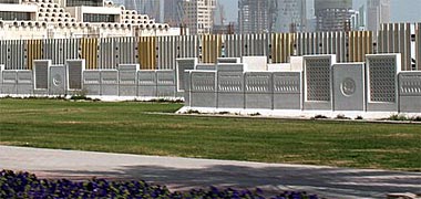

The initiative of using good quality pre-cast units was begun in the New District of Doha where, in the first instance, pre-cast concrete wall panels were produced for the Senior Staff housing area. There concrete walls incorporated panels for the different utility services as a way of maintaining a comprehensive appearance to the area, and some of those units were constructed early in the development of the area. The benefit of this is that the utility positioning and hook-ups can be made at an early stage in the contract – sometimes with the roads being constructed up to sub-base level, enabling rapid development of the residential units. Here, adjacent to the Post Office on the New District of Doha, four different pre-cast panels have been used to provide a boundary wall. Quite why there is another fence behind them I’m not sure, though I suspect it has something to do with construction activies. You can see from the lower of these two photos that the pair of walls produce an attractive element of urban design.
Elsewhere I mentioned the use of high quality pre-cast panels both as boundary walls for both the Intermediate Staff housing project, as well as the Senior Staff housing on the New District of Doha. This type of construction method was also used for the University project and then the Diwan al Amiri, particularly in the latter two examples where extremely high quality finishes were developed, a process that took some time to achieve.
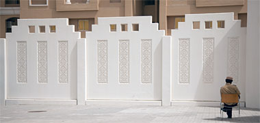
This type of work is continuing to be rolled out across the State and is one of the methods by which good quality work is being effected. This first photograph illustrates a boundary wall comprising three main elements: the panel, a pillar to which the panels are connected, and a base unit used to level up and produce a consistent detail to the foot of the wall. It is neatly designed with an inverted shurfa implicit at the top of the junction between the panels, and a further visual softening of the top of the panel by the elimination of three small squares.

The inset panels of implied naqsh relieve the main panel with their decorative interest but have a strange feature in them. If you look at the running pattern at the edge of the naqsh you will see that it is broken at the centre. Why this is so I have no idea as I have never seen this on a panel of in-situ naqsh. It appears to be a deliberate feature and could have easily been eliminated. Perhaps it has been designed in a similar manner to that associated with carpets where it is said that there is always a design feature of incorporation or elimination that breaks the regularity of the overall pattern.

When the Corniche was first contemplated, there was a deliberate decision to construct seating as an element of the sea-side pedestrian system. Much of this was accomplished with the use of large solid blocks of concrete which were seen to be extremely effective at combining protection and seating. In this photograph, the landward pre-cast concrete elements – which are replicated on the seaward side of the pedestrian path – can be seen to be simple and effective both in defining the separation of hard and soft landscaping as well as acting as a continuous seating element.

In this photograph there are units which have a similar sense of scale but have the added advantage of having lighting built into them, illuminating the pavement. This is an effective way both of providing seating and creating safety lighting. In many areas this form of seating is used additionally as a security device, either keeping vehicles from accidentally or deliberately driving onto pedestrian areas or from driving at security targets.

The elements of urban street furniture I have commented on above are only a small number of the items that make up the streetscape with which we come into contact on a daily basis. It would be nice to think that the different items that comprise the street, in its wider context, would be thoughtfully integrated. This was realised in the nineteen seventies when a coordinating committee was established for all the utility departments working to develop the New District of Doha. This was successful, but it is easy for bad decisions to slip through the net. Here is an example from a street in Doha where a triangular access panel – always a problem for abutting materials – has been located a few degrees off its correct alignment. Somebody has made an attempt to cut the concrete paviors around it, but with little success. Items like this need to be carefully selected, correctly aligned, well detailed and properly executed because, when they are not, they show themselves up badly and let down the quality of the surrounding area needlessly.

Some of the most common elements of street furniture seen in and around the peninsula were developed early and have changed little or not at all. Concrete bollards were introduced a long time ago and continue in many parts of the State as an inexpensive solution to a perceived or actual conflict between people and vehicles. The early development of the New District of Doha saw the introduction of high quality pre-cast concrete designs in the form of bollards, planters and boundary walls and set a new standard, so it is disappointing that the old-fashioned bollards are still being used. Due to the problems with the steel reinforcement corroding, the concrete tends to spall, as shown here, not only detracting from the look of the bollards, but also reducing their structural integrity and making them more prone to damage and failure due to lateral impacts. The use of yellow and black banding, which has become a standard response by traffic police to marking bollards and kerbs, is also questionable as they no longer suit the improved design standards being developed throughout the State.

There is an obvious visual link between these concrete vehicle barriers and the concrete posts above, but the reason for the inclusion of this photograph is to underline how we come to accept, as part of our urban environment, elements which have been devised and introduced for engineering or similar purposes, in this case to do with security in its wider sense. Considerable efforts are made to provide quality in our urban environments and, hopefully, to integrate a range of elements from buildings and hard and soft landscaping to items relating to communications, security, convenience and the like into the environments in which they appear. But items such as these vehicle barriers – albeit appearing in a relatively rural setting – are, by their very design intent, intrusive, and can appear to be alien. Nevertheless, we accept them without a second thought.
more to be written…
Graffiti
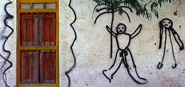
There is mention, a little way above, of graffiti, in that case the graffiti had no artistic merit and were spray-painted onto a government pre-cast concrete unit, appearing to be a malicious or at least mindless marking of a good quality concrete wall element. By contrast, here is an obscene addition to an abandoned home in feriq al-Salata, taken in the mid-1970s.
There are still graffit to be seen round the peninsula. Searching for a recently restored masjid on Google Earth I came across some graffiti of a different character which I have assumed to be commercial, but which certainly liven the boundary walls of buildings in al-Jumailiyah, in the north-west of the peninsula. I was only able to find these two examples which were recorded in April 2023.


The first of these two graffiti can be seen when travelling south down Lebsayer Street and is on a wall of Street #808 facing north. The lower graffiti is on a corner at the east end of Street #804. The first is strategically placed as the focus for anybody driving south down Lebsayer Street; the second is situated on a corner facing anybody entering the town from the al-Ghuwairiyah Road.
Graffiti are often thought of as being illegaly applied, but these appear to be exhortations or platitudes and are therefore likely to have been commissioned by the local authorities from a Qatari business company which has tagged its work. Their styling, both in the letters as well as the hand are very typical of illustrations seen in various local media products.
I’m not absolutely sure of the nuance of the graffiti, but think that the first means that ‘we are all responsible’ – set in quotation marks – and that the second means ‘al-Jumailiyah deserves the best from its children’.

Of a very different standard of design, but one I believe would also be classed as graffiti, is this work, running the full length of a wall. It is a piece of calligraphic art and reads ‘jumailiyah’, meaning beautiful or elegant and from which this small town is said to have derived its name. This is an attractive way of softening the harsh lines of the long wall. It appears to be tagged at the right hand end, but I can’t read it.
The graffiti is situated on a wall on the east side of the al-Ghuwairiyah Road, just north of its roundabout junction with the al-Jumailiyah Road. The name on the flank wall of the building behind the graffiti seems to read ‘kenar at jamiliya’, kenar being a flowering green shrub with the scientific name ‘Ziziphus nummularia’.
more to be written…
Balustrading in public areas

Many of the elements which comprise street furniture have had very little thought given to them both in their wider context as well as in detail. Balustrading, for instance, is often introduced for its capabilities as a protective or security barrier, but with little thought being given to its place within the urban design of an area. Consideration is given to issues relating to height, visual permeability and lateral resistance, much of this being enshrined in regulations designed to ensure minimum standards are met. Yet it can be a large element of an urban scheme. Take the Corniche in Doha, for instance.
The illustration above shows the Corniche by the Diwan al-Amiri in March 1979 with the balustrading running from the Port roundabout to the Ruler’s jetty at that time. The balustrading was constructed from vertical pre-cast concrete posts with three inch galvanised steel tubing running between them. The purpose of the balustrading was seen to be the natural way to trim and make safe the interface between sea and pedestrians, it having been decided that there would be a pavement running from feriq al-Hitmi through the Port area and on to the Sheraton.


In a sense this replicated the pattern of decision-making in many of the other Gulf States. These next three photographs were all taken in Abu Dhabi, though similar designs were being incorporated into sea-side positions in other Gulf States, many of them having cities developing immediately adjacent to the sea. While there may have been a perceived need to protect people and vehicles from falling into the sea, the designs selected had little or no understanding of what was needed in urban design terms for their locations. These first two designs were both photographed in 1972, the upper showing little imagination and the lower at least attempting to present something of the necessary scale of a seaside balustrading within a straightforward traditional design, though one that might have been found anywhere – either beside the sea or anywhere inland.

This next design was also photographed in Abu Dhabi, but nine years later, in 1982. At some stage a decision seems to have been made to produce a more decorative balustrade. There is a faint hint of what might be considered an Islamic styling to it with the ogee light feature, but it would be fair to say that the design shows no real improvement on the designs above which preceded it, and the sub-divisioning of the balustrading having no relationship with the lighting element as might have been hoped.
What all these designs illustrate is not only the lack of connection with the sea but, from the point of view of anybody driving an ordinary car, a physical barrier to looking at the greatest attraction there can be by the sea – the sea in its different states and the craft that sail on it. This lack of understanding created not just a physical barrier but a psychological constraint on those using the Corniche. Put another way, and bearing in mind that the Corniche was created to focus on the bay, the opportunity to connect with one of the most important traditional resources was removed by these physical barriers.
What all these designs illustrate is not only the lack of connection with the sea but, from the point of view of anybody driving an ordinary car, a physical barrier to the sea, usually obscuring the junction of sea and sky. Their second failing was that they generally did not have the scale and mass required for man-made elements beside the sea.
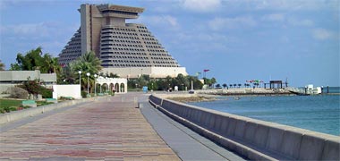
Because of this, the decision was made in Doha to produce a design which both allowed those on the Corniche to see the sea, but also had the scale necessary for an urban design element in this position. Not only were these parameters obvious, but they might be incorporated in a design which allowed people to sit instead of requiring additional seating to be located along the Corniche for pedestrians. The resulting design is seen here; a simple, strong design, protecting pedestrians and facilitating enjoyment of the sea.
This has been one of the most successful designs in public areas not just in Qatar, but elsewhere along the Gulf. But not every balustrading design can be thought as successful.
Grand Hamad Boulevard runs for around twelve hundred metres from its junction with Ahmad bin Muhammad bin Thani Street, north to the Corniche. It was designed on the grand scale as a dual-three motorway with adjacent access and parking roads together with a landscaped, central median. The landscaping was conceived as being relatively small – essentially flowers, shrubs and no trees, as these two photographs illustrate. In the centre of the median a decorative metal balustrading was erected its purpose being to prevent people crossing the road except at designated crossing points, of which there are few. It is evident from the detailing of the balustrading, that it was conceived of as a design element to be viewed over the planting, and not hidden.


From a design point of view, the decision to have weak visual elements in the centre serves to emphasise the width of the road, giving it a small degree of colour and softness at its centre, but accentuating the harder elements of buildings, roads and vehicles. The softscape, particularly in its early years as shown here in the first two photographs, taken in 2002, seems too small for the scale of its location. But the hardscape elements, the paths and balustrade are also weak elements in the design. In hot weather people want to cross where they can and although the balustrading is a little higher than usual, it is not high enough to stop people climbing over it where they wish. Nor is the design of the balustrading strong enough to resist a vehicle crashing at speed. The decision to have a narrow path on each side of it is also curious in that it is places pedestrians immediately adjacent to the fast lane of the road, its narrowness placing them at risk. A more sensible decision would have been to have them in the centre adjacent to the balustrade and, better, to remove the balustrade and make the softscape the barrier.

By 2008, when the third photograph was taken, there appears to have been a diminution of the planting palette and a deterioration in its maintenance. This is disappointing for what was designed as a vital element in the urban distribution hierarchy. This visual weakness created by the dearth of appropriate planting material, but with its potential to contribute positively to the urban environment, is emphasised by the lack of containing buildings on each side at its north end where it opens up towards its junction with the Corniche.
more to be written…
Movement structure
Qatar, like other states in the Persian/Arabian Gulf, has built itself with the revenue from oil and gas. This wealth, in addition to enabling the state to develop rapidly, has meant that this resource has literally fuelled the development of activities benefitting from relatively inexpensive energy. Elsewhere I have written about the way in which this has had an impact, such as upon the air-conditioning of buildings and the watering of the desert, but it has also been responsible for the growth in motor vehicles and, therefore, the road system.

The original roads in Qatar were just tracks, consolidated by usage and, usually, heavily rutted. Driving along them either had to be fast or slow, anything in between creating a great deal of discomfort. The main routes were reinforced simply by compressing the ground and stabilising it with oil. They deteriorated in the rainy season with large potholes being created. But they seemed to suit the traffic of the early days which was associated with exploration, security and the construction industry. With the increase in wealth the roads were widened and better constructed. There are still one or two roads in the peninsula which have something of the character of the past. I’d hate to see them go…
The relatively inexpensive fuel for vehicles, combined with planning policies that have promoted a hierarchical road structure, has resulted in a very heavily trafficed road system. Pedestian systems are generally not a feature of the major road distributors other than to lead pedestrians to them for the purpose of finding transport – taxis, in the main.
Originally the road system was envisaged as a series of ring roads with the ‘A’ and ‘B’ ring roads locking onto the coast at their north and south ends, and the ‘C’ joining the north road at the television station at Al Markhiyah, its east end also locking onto the coast between feriq al Salata and feriq al Khalifat; essentially a closed system.
The 1980s saw the solution of a problem relating to land ownership. Development in the centre of the town had proceeded with most people happy to have their land taken for road and associated development, this being exchanged for land and a house on the outskirts of the town. The larger land owners were a little more difficult to deal with as they would be anywhere, so there was some delay in developing solutions which incorporated them within a newly developed structure plan prepared by British planning consultants.
Doha bay was relatively shallow and not very clean. The coast ran more or less straight north from feriq al Bida with the land incorporating a mixture of land types, including sabkha and the occasional dahl.
The decision was taken to dredge the bay and use the spoil to reclaim land. American planners were brought in to produce a coherent plan taking into account the pressures on Doha to expand and the need to plan for future development. This saw the forming of the bay into a more recognisable shape, essentially a circle, and the organisation of the dredging spoil into a shape suited to future development.
The north end of the Doha road system was freed and extended by routing it through the New District of Doha. The south end, with the development of the ‘D’ ring road, was organised to facilitate development to the south of Doha.
The key to this strategy was that it brought into government ownership a large area of land – the land that had been reclaimed from the sea – enabling that land to be planned and a number of important civic elements located within it. These included, but were not limited to a prestigious five hundred bed hotel; the Diplomatic area; the central Post Office; Ministry buildings; a commercial area; Senior Staff housing; and a University being established to the north.
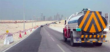
Perhaps more importantly, the ability to develop this new area of government land enabled the government to establish new, improved standards for utilities and require the various governmental departments to co-ordinate their activities in order to reduce – and, preferably, prevent – the damage caused by utilities working over each other. This was particularly required of the roads as the habit of trenching across roads annoyed a number of people. Ducts were designed and utilities co-ordinated in them across the New District and the start was made for a system which could be developed throughout the country. However, it is not always possible to maintain this standard. This photograph illustrates a poorly patched road following the installation of utilities below it rather than in the verge. Having said that I would guess this road, although striped, is a temporary arrangement as it has no kerbs and, perhaps, is awaiting a finish coat.
Generally speaking the roads were designed to separate categories of traffic, both vehicular and pedestrian. It is fair to say that there was no consideration for local habits, traffic thought to be the same everywhere in the world. Very few grade separations were considered due to what was considered to be, at that time, relatively low levels of traffic and cost.
Both the British and American planners laid out their designs in the Western tradition, the emphasis starting with the sizing of the major roads and decreasing in scale to the local distributors and access roads – all this premised on planned growth on what was then considered to be reasonable models. Residential sites were set out orthogonally with boundary walls, generally thirty-five metres square, within which a two-storey house was located centrally with a set-back from all boundaries. This reflects Qatari concerns for security in relationship to development on party walls. The set-backs establish much of the character of the urban design of the residential areas.

Here are two photographs of typical new urban roads illustrating the concepts used. The first is a dual-three arrangement used for the major distributors. The road take includes not just the dual-three lanes but a central median wide enough to incorporate reasonable planting on raised beds set above concrete kerb vehicle barriers. At the sides of the dual-three roads there is an arrangement to allow parking serving the commercial properties facing the roads. In most cases there is a relatively narrow separating space between the two systems just wide enough for fencing though, in the first photograph, a strip of ficusplanting can be seen, implying a wider allocation. The service access road serves diagonal parking. The purpose of this arrangement is to reduce conflict between moving traffic on the distributor and reversing, parked cars. There still remains conflict between the reversing cars and those on the access road though this is a relatively normal arrangement all over the world, the traffic theoretically moving at slower speeds, and any resulting accidents relatively safe. Note that there is no deceleration lane for traffic entering or leaving the access road.

This second photograph illustrates a typical dual-two road incorporating a minimal median strip with a fence to contain and reduce impact between oncoming vehicles as well as to thwart pedestrians wishing to cross. Again the road has commercial development facing across it, and incorporates diagonal parking with no separation from the road lanes. Conceptually, this is not as safe as parallel parking, the driver having significantly less capability to see oncoming traffic as he reverses. Theoretically road traffic is travelling more slowly, but drivers everywhere speed, and there is really no practical difference in speed between vehicles on the inside lane of dual-two and dual-three roads.
The purpose of these comments is to make the point that the design of these roads is not significantly different from what might be found elsewhere in the world.
more to be written…
The road standards were, essentially, American, though the design and planning of roads prior to this had been to British standards and well organised by the Engineering Services Department of the Ministry of Public Works. The road construction programme continued with the new models, with only two difficulties causing problems:
- quality of the aggregate, and
- co-ordination of services.
The first has been mentioned elsewhere, but is worth repeating here. Qatar is a peninsula with, mostly, a soft limestone from which the aggregate is won for all building requirements. Limestone is readily attacked by water, dissolving and leaving voids. It is the same characteristic that will produce a dahl in the desert. Because of this, roads can deteriorate relatively rapidly, though the importation of harder aggregates has helped slow this process both on roads as well as on sea defence work.
The second issue is one that has caused problems all over the world, not just in Qatar. Every utility department has, traditionally, carried out its work of planning, installation and maintenance separately. As a consequence it is not uncommon for roads to be dug up on what appears to be a random and, apparently, unco-ordinated basis . The result is an irregular pattern of repairs of differing qualities which, apart from looking unsightly, contribute to the deterioration of the road surface while, during their execution, constraining traffic.
The solution to this in the New District of Doha – and because it was a completely clear and new site – was to form a co-ordinating utilities committee and ensure that, in the first instance, sufficient ducting was established beside the roads with the necessary crossovers to accommodate the planned development. Although mistakes were made they were mainly due to expanding requirements for housing as nobody was able to foresee the loads each house would be likely to take due to a number of factors mainly to do with the novelty of the new developments and the expanding interests of their clients. Other difficulties revolved around the proximity of utilities in terms of distance and depth as well as compatibility and security aspects.
Essentially, the road and utility infrastructures were envisaged, planned and constructed as a single system. One of the results of this inter-departmental cooperation was that the working method fed out into Doha’s existing infrastructure enabling improved co-ordination in the more difficult situations to be found there.

I should also mention the Corniche here. A major element of the road distribution system, it was conceived not only as a grand, ceremonial or processional route, but also as the spine for mainly passive recreational activities focussed on the sea. Not only does it serve as a fast distributor from one side of the town to the other, temporary structures span it from time to time, usually to mark or celebrate an event as is shown here.

But more permanent decorative structures are also now being associated with it. There is an illustration of the crossed swords at the south end of Grand Hamad Avenue on the previous page. Here is a simple arch at what has come to be known as Arch roundabout. Set at forty-five degrees to the roads entering the junction it can be readily seen to mark the junction. Sculptures such as this serve to provide vertical accents to the town, and way-markers for those travelling the circulation system. They also relate to the comments made earlier.

But it was also envisaged as a place for promenading, individual fishing and reflection as well as for exercising and non-intrusive play. The pedestrian element is backed by off-road parking, sheltered by planting and is broad enough to be comfortable in use while also incorporating a number of nodes accommodating events or small retail outlets. In particular, you can see from the photograph that one of the most important elements in its design was the incorporation of a sea wall high enough to sit on and broad enough to provide safety; the key decision being made that, in common with the majority of marine constructions, it would not prevent visual enjoyment of the sea, a problem with many promenades incorporating railings.

However, since I made the above notes the results of considerable study given to the problems created by the various forms of traffic on the roads, have been published. For years there have been continuing complaints from both the public and private sectors regarding the difficulties of moving about Greater Doha.
The city has grown dramatically and continues to do so. With this growth have come a range of problems of which circulation has been one of the most serious. Ashghal have rolled out a five year plan that looks to the period until 2012, and that hopes to upgrade and develop the road and drainage systems in a sensible and responsive manner. Programmes of this nature are rolling programmes so will change year by year while maintaining a five year focus. This illustration gives some indication of how the State sees Doha developing.
There is a considerable programme of work planned by Ashghal. Much of this has to do with improving the capabilities of the Salwa Road, North Road, Dukhan Highway, Doha Expressway and Rayyan Road, some of the primary distributors in the peninsula. Other roads are also being upgraded within the same period in order to produce a coherent road system.


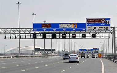
It is some time since the above note was written and much has happened in Qatar over recent years. In particular, the amount and scale of road infrastructure has increased dramatically with an extra push being made to be ready in time for the anticipated pressures that will accompany the FIFA games at the end of 2022. This note is intended to give a small indication of how some parts of the State are now looking, in this case, with regard to road travel. This first illustration is an aerial view of part of the Mesmaimeer interchange looking approximately east with the al-Thumama stadium top right in the photograph, and the road to Wakra and Umm Said leading out of the picture mid-right.
The second image, a map covering the south of Doha, shows the location of the junction and its five major linkages within the network of Qatar roads.
At the end of May 2022 Ashghal, the Public Works Authority – successor in 2004 to the old Ministry of Public Works – announced the opening of the Mesaimeer Interchange to full traffic. This is the final route connecting Wakra to Doha with drivers coming from the Mesaieed Road now able to reach Nuaija, feriq al-Ali, rawdhat al-Khail Street and the ‘D’ Ring Road, significantly shortening travel time.
The third illustration shows the interchange in more detail, the graphic stating that the last remaining one-direction two-lane road is open to those driving north who can now access directly rawdhat al-Khail Street and the ‘D’ Ring Road, the road now capable of taking around four thousand vehicles an hour.
This fourth illustration gives an indication of the size and character of one of the larger roads in Qatar, the Doha Expressway south of Doha which bypasses Wakra to its east as it moves south towards Mesaieed.
Petrol stations
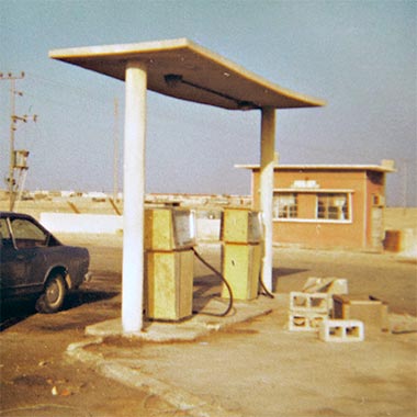
With the development of the road system came the concomitant need to provide vehicular traffic with fuel, both diesel and petrol. Early petrol stations were simple affairs as this photograph, taken in the early 1970s illustrates, with a need for only two pumps in this case, I believe, both serving petrol. I think this petrol station was near to Medinat Khalifa, but can’t be certain. There were a scattering of similar petrol stations around the country, usually associated with settlements, but the concept of their being near major intersections took some time to develop, and there was rarely any queuing to be served. The photograph shows that these first stations were basic, the only accommodation being a small building, seen here in the background, and used as an office and a place for the person supervising the installation. It was a self-service operation though, later, people were employed to clean windscreens and, later, to wash cars.
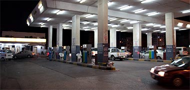
Thirty years or so later, here is a petrol station near the Arab Bank roundabout, photographed at night in 2008. The pumps have been given a solid cover with sufficient clearance for tall vehicles, compared with the ineffectual canopy designed to cover the pumps in the photograph above. Most of the new petrol stations have similar cover to protect pumps and drivers from rain and sun. The stations generally have similar facilities to those found elsewhere in the world and, like much of Qatar, are kept very clean by the ever-present labour force.

It is generally understood that the price of petrol at the pumps in the Arabian peninsula is significantly lower than in most of the world, but it still comes as a shock to European visitors when they first see the posted rates on the pumps in Qatar. I’m not sure what the distinction in prices shown here on the meter is, but they are given as 70 and 80 Dirhams a litre, equivalent to around 13p and 15p in British Sterling.
Strategic links

In 2008 it was announced that the link between Qatar and Bahrain was at last to go ahead, and would be known as the Qatar Bahrain Friendship Causeway. There has been talk of this link since the 1980s when the Hawar islands problem was taxing the two countries. Some strategic work was carried out at that time but, in 2009, it was stated that work would begin in 2010 with the intention of completing the work by 2014. At a cost of around $3 billion the project is planned to be completed within four years. However, the end of 2009 saw the possibility of incorporating a railway, an element that would increase the cost by around $5 billion, with an undisclosed effect on the timing.

The causeway will link Ras Ushairij on Qatar with North Askar on Bahrain. The character of the waters between Qatar and Bahrain present a number of problems for the designers, particularly with regard to the aggressive chloride and sulphate character of the Gulf water. To resolve this and other problems, the link between the two countries will be by a marine causeway, approximately 40 kilometres long, of which 22 kilometres will be bridged to allow marine craft to move below it, together with dams and islands, and with talk of an intermediate island with, as yet, undisclosed facilities.
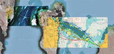
It is interesting to speculate on the amount of use the causeway will accommodate. Initial projections suggested that 6,000 vehicles a day will use the road elements. For comparison, 10-15,000 use the King Fahd causeway between Saudi Arabia and Bahrain. It is not known the extent to which these numbers reflect the relative strictness of the different regimes. At present both Bahrainis and Saudis wishing to come to Qatar must do so from the south of the peninsula. With the new causeway both Saudi and Bahrainis will be able to move into Qatar from the top of the peninsula, probably a more direct route from Dammam than the southern entry point. The Bahrain-Qatar causeway may even be a preferred route from Saudi to the United Arab Emirates. Tolls, Customs, car insurance checks and immigration procedures may slow progress, but crossing the marine causeway should take only around half-an-hour.
I have also seen projections of 10-12,000 vehicles a day using the causeway. If the railway is incorporated it is likely to cater for a different group, mainly the non-nationals of both countries, but it is difficult to say how this might impact use of the road.
Pedestrian movement


As mentioned above, the Corniche was envisaged as being a special element of the city, bringing people to and along it not just for recreational purposes but also as a setting for relaxation in relief from the activities of the city behind it. In this respect the pedestrian elements act as a relief to the road system and as an opportunity for everybody living with reach of it. It was envisaged as a novel element in the urban vocabulary of Doha, but one which would cater for a range of perceived needs and activities. This photograph deliberately shows it with no activity on it in order to give an indication of what a well-considered pedestrian route might physically comprise. It is a simple, paved route with planting one side, the sea on the other. Access can be made to it from any of the parking areas immediately adjacent to it. The lower photograph shows what is uncharacteristically light traffic along the Corniche, the pedestrian element of the Corniche being on the far right of the photograph. Comparing the two photographs it is evident how difficult it can be to cross the vehicular element of the Corniche, and how attractive the pedestrian movement system is in the upper photograph, once reached.
I have written above about the heavy dependence on vehicles and, elsewhere, about the character of the population, many of whom are not able to afford cars individually. I have also written about the hierarchy of movement from the private to the public space in which it is implicit that this process is pedestrian as it has always been. This movement from a house requires protection and direction and is likely to take a mixture of nationals as well as service personnel employed both in the private and public sectors.
The New District of Doha was an area where this could be carried out, though it was not as thorough a system as was set out earlier in the Salata Jadida area south of Doha. Nevertheless, a pedestrian movement system was incorporated as an equal element of the movement system, designed both to enable people to move between houses as well as to roads where they might find transport. The system is not yet complete and is likely to be improved in the future with shading and seats.
The main point here is to understand that movement systems are an integral part of urban design; they are as much elements in their own rights as are the buildings and hard and soft landscaping that are usually considered to be the constituents of urban design. It is the action of people moving in and around buildings that give them life and, conversely, it is the systems of movement and buildings that give life to the people using them.
Vehicular movement
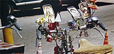
Much has changed in Qatar over the past two or three decades. This is true not just for buildings but also with regard to the vehicular movement system. There are still a number of cyclists with their customised bicycles on the road, but not as many as there used to be. Perhaps this is accounted for by the much greater amount of traffic there is on the road and which is likely to have put them off. This bicycle does not, of course, belong to a Qatari but to one of the many workers in the country.

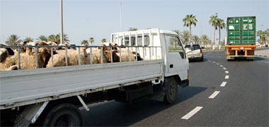
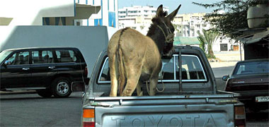
Apart from customised bicycles, such as that illustrated above – note that the single mirror points up to the rider, not to the road behind him – the visitor to Qatar may notice that there are certain practices on the roads which are different from those they might be used to in their own countries. There are always different driving habits, but I’m not talking here about these, nor about the very different ratio of ordinary cars there are to four-wheel drive, desert-capable and the highly visible construction industry vehicles.
One of the most noticeable differences is in the transport of animals. The badu, for instance, use pick-ups as a favourite and extremely useful form of transport as they often have a need to move large items that would not fit into their usual four-wheel drive vehicles. Because of this it is not unusual to see camels, sheep, goats or, the lower case, a donkey being moved from one part of the country to another in the back of their vehicles. The only other time you are likely to see animals transported around Qatar’s roads is in the lorries moving sheep for the rituals associated with ’eid, when large numbers have to be moved in a relatively short period of time and are customarily transported in multi-level lorries both from the Saudi hinterland as well as from ships specially equipped to bring them in.
The visitor to Qatar will also be struck by the amount of traffic on the road. This has been increasing, apparently exponentially, since the nineteen seventies. High levels of income, inexpensive fuel and a large construction industry have combined to produce the existing road system and its traffic. While nationals tend to have a number of cars for their own use, there is a need for moving people that has been supplied in the past by lorries, vans and buses.
It may seem unfair to criticise the large scale initiatives taking place in developing many of the Gulf States, but in a variety of areas it is proving difficult to keep the necessary disciplines in step with each other. Bear in mind that all this development is relatively recent.
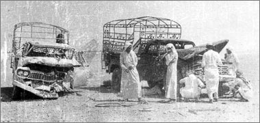
There have been problems with the roads as long as there has been traffic, and not all crashes are on roads. This old photograph shows the results of a collision between two pick-ups, apparently not on a road. The licensing and driving test systems are now different, but many of the older drivers began their driving careers using vehicles in much the same way as they would use a horse or camel. While roads were the formal routes between conurbations, many of the routes travelled followed traditional paths, meaning that much driving was carried out off-road. The character of the desert meant that there were obstacles to be dealt with, so it was not unusual to find wrecked cars in the desert. Note the traditional decoration of the welded steel frame to the vehicle on the right.
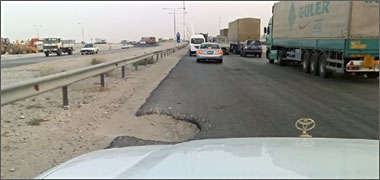
Integration of construction and maintenance is, for instance, often a problem as it is usually easier to build than maintain, the latter requiring a more sophisticated operation both in terms of identifying and planning operations as well as execution. This is particularly important with the relatively soft aggregates found in Qatar and the environmental conditions in which roads are constructed and used. Integrating all the construction disciplines has always been a problem but is improving.



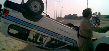
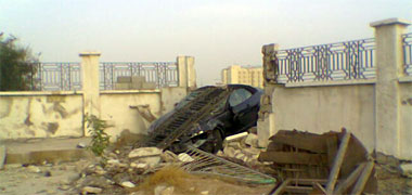
Construction activities associated with the installation of utilities and road building are now controlled, particularly in their integration. Lack of integration used to be a serious problem but, in the 1980s, initiatives were introduced in an attempt to get over the problems caused by newly completed roads being immediately excavated for the installation of utilities, an issue which increasingly irritated a number of people both within and outside government but which were commonly thought to have been impossible to organise.
Initially this integration was created by the formation of an inter-ministerial utilities committee operating within the newly developing New District of Doha, the extension to the north of Doha created by filling a part of Doha bay. As the work progressed there, a directive was given to extend the operation outside the New District. But there were and are still difficulties caused by a number of issues.
A combination of unprotected works and poorly maintained roads – both in terms of surface deterioration as well as the presence of sand which will affect steering control and stopping distances – together with unsuitable lighting combine with a wide variety of driving skills, driving habits and vehicle maintenance to contribute to crashes and casualties in the country. Even though road accidents are dealt with efficiently and the vehicles moved relatively quickly, it is still common to come across the results of accidents, particularly within urban areas.
The presence of sand on roads is certainly a major cause of lack of friction of tyres on the road surface and drivers’ subsequent inability to control their vehicles. It is almost impossible to keep roads completely clear of a material which is constantly drifting across the ground. This problem points to the need for slower speeds and more careful driving patterns.
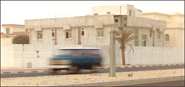
Particularly in Doha, traffic movement is heavy, and there has been much comment in the press and elsewhere about the problems associated with driving and road capacity. The earlier roundabouts were changed some time ago to crossings governed by traffic lights and roads widened, but traffic still alternates between slow-moving and speeding, the latest contribution to the latter problem being the introduction of speed cameras.
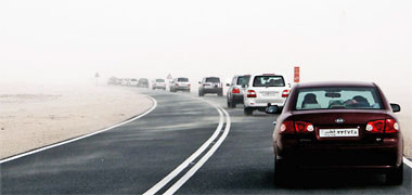
I have mentioned elsewhere the problems caused by sand and dust in the atmosphere and the difficulties it causes both environmentally as well as with regard to building interiors. But, of course, it can also be a serious hazard, exacerbating driving conditions. Here a light shamal can be seen to be reducing visibility. It’s not yet too difficult to see, but it can get considerably more dangerous, particularly as traffic bunches up.

But it is not just sand and dust which are problems for those living and, particularly, driving around Qatar. Fog can be a serious problem in the winter months before the sun burns it off. It is common across the peninsula but can be worse near the coast. Here is a road scene which illustrates the similarity between the difficulties caused by fog and sand storms, and the need for effective controls to help safeguard drivers and their passengers – as well as pedestrians, of course.
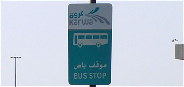
Thirty years ago many of the contractors moved their staff by lorries but this was superseded by buses for a number of reason relating both to safety as well as status, contractors realising there was a benefit to treating their workers better. But the taxi appears to be the main vehicle on the roads. Driven, in the main, by ex-patriate drivers, they circulate in order to move workers around the town. There is considerable competition for the work and, sometimes, a difficult relationship between owners and drivers. To add to this, they now have competition.

There have been buses used in the country for a number of years but they were first brought in by companies transporting their workforce as an improved service from the lorries, as I mentioned above. Anecdotal evidence was that the workers saw themselves as having higher status when treated better. The Ministry of Education then began using buses to move students around and these yellow buses became a feature for years on Qatar’s roads.

Finally a brief note on another issue relating to movement safety. As you can see from photographs above, many accidents see vehicles leaving the road or crashing as the result of road or environmental conditions, or the losing of control by the driver. The press suggest that there are a significant number of such vehicular accidents, the police attempting to educate drivers to practise safer driving. Here a car is on fire following an accident on the North Road. It burned because nobody had fire extinguishing equipment either in this car or the lorry also involved in the accident.
Public transport system

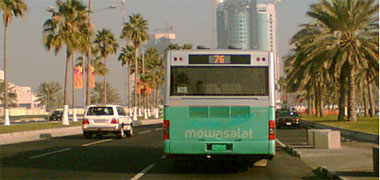

In 2005, the company Mowasalat introduced the beginnings of a national bus system for use by the public. Originally operating on restricted routes the system is being slowly expanded in an attempt to reduce the number of smaller vehicles moving people around not just Doha, but the whole of the peninsula.
Much of the traffic on roads was perceived to be susceptible to the benefits of an efficient, air-conditioned and comprehensive bus system. It was thought that this argument would apply to those using the privately operated orange taxi service, some private cars as well as those using many of the people carriers and small buses that commonly take people around for companies. It was believed the service would be attractive in providing a reliable operation across Doha and the rest of the country leading to its being adopted by significant numbers of the travelling public.
Experience is that the system caters mainly, if not completely, to the expatriate community but not to nationals as must have been obvious. It is true that a number of nationals do use small buses, but these are institution based, moving their personnel between their homes and places of work. These buses and people carriers are particularly oriented to the movement of nationals who are women.
It also seems that schoolchildren appear not to use the buses. It will be interesting to see how the bus system develops bearing in mind that it is cutting into the taxi operators’ revenues which, they feel, are not that great at the best of times. This has been an issue in other Gulf states, and appears to be difficult to resolve. Children being taken to and from school in private cars, taxis and buses is a significant addition to the traffic loads on the road system in Doha as it is in many parts of the world.
The taxi system appears still to be in a state of flux. The older taxis, privately owned and distinguishable for their orange colour have been superseded by the green ‘Karwa’ taxis, operated by the Mawsalat company.

In Qatar there is a problem, yet to be resolved, with the buses timed to run at thirty minute intervals, requiring passengers to wait – in summer – under the hot sun much longer than they need to for the ubiquitous taxis. Some shading is now being provided but, as is common in many design areas, the shades are not always providing the necessary shading. The bus shelter outside the Kuwt fort in the centre of Doha, for instance, faces directly west and some of those waiting are forced to stand behind it to obtain a little benefit of shade.
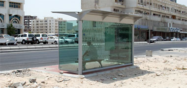

A start has been made on this problem in the provision of a standard design. Here is a bus shelter on the north side of the Rayyan Road – a road which runs east to west – and which is therefore open to the south side. The photograph was taken on an August afternoon and it can be seen that the design of the shelter provides shade behind it, but not that much to anybody sitting inside. The design is also only suited to a position where it doesn’t block pedestrian access past it.
On the other side of the road there is restricted access so there is no shelter, the adjacent buildings providing the shade. The sign marking the bus stop is not that easy to see comprising as it does a small, plastic, A4 notice attached to an existing road sign pole. I assume this is a temporary measure until a proper sign, such as that shown above, is introduced here. With time these problems may be resolved, but it is interesting to speculate as to whether Qatar will go the way Dubai has where some of the bus shelters are air-conditioned.


All this is fuelled, literally, by petrol and diesel which, being in plentiful supply, do nothing to discourage the use of an increasing numbers of vehicles using the roads. Here is a night view of one of the many petrol stations, this being in the centre of Doha with, below it, a view of the price in August 2008, illustrating it to be about a tenth of the price of petrol in the United States.
Two of the characteristics of the roads in Qatar which strike the visitor are the heavy traffic loadings at all times of the day, particularly at rush hours, and the larger size of the vehicles on the road. The price of fuel is obviously one factor which drives this, but it is also worth remembering that larger cars, particularly those with four-wheel drive are necessary for many families who will drive into the desert at weekends. Even though most places can be accessed with two-wheel drives, four-wheeled driven vehicles also tend to have higher and better driving positions as well as providing additional comfort for driver and passengers.
Rail
In 2005 a study was made by Ashghal, the public works authority, for a rail system to be constructed in Qatar. Since the burgeoning of development in the State in the nineteen sixties, there has been a massive load on the distribution network to move the necessary materials supporting the pace of construction. This has created nuisance and hazard on the road network and has been a constant source of concern both for those suffering from it as well as those attempting to ameliorate it through planning and other related activities.
This rail system was seen as being designed for the transfer of goods and would link Abu Samra, the border crossing with Saudi Arabia, the 85 kilometres to the Industrial Area south of Doha, and from there, 16 kilometres to the new airport and, I believe, on to the sea port. A link has also been studied for the 35 kilometres between the Industrial Area and Umm Said Industrial City.
If the work goes ahead it should have a significant effect on the distribution roads from which it derives its traffic, but there will, of course, have to be secondary distribution from the rail heads created by the new system. It will be interesting to see how this initiative works out.
In a development of this, August 2008 saw plans announced by the government for a German company to produce a plan for the development of a rail system. See the note on public transport above.

This planning has now seen fruition with Qatar and Bahrein signing a contract with Deutsche Bahn in November 2009 for the construction of the lines, together with the link to Bahrein. The system will see a significant change to the existing transport network of Qatar and the habits of the peninsula’s travellers. Illustrated here is an artist’s impression of one of the termini.
This is an extremely large project with present costs estimated to be between four and five billion dollars, though a slightly smaller cost has been announced. As an aside it should be understood that many project costs are attributed to related budget heads, so it is sometimes difficult to obtain an accurate estimate. Work on the project begins in 2010. Qatar wishes the project to be completed by 2022, a date determined by Qatar’s hopes to host the World football cup. The final line construction and associated facilities should be completed by 2026.
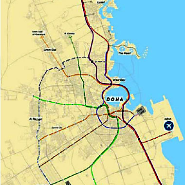
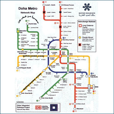
The published intent is to produce a system that will compete successfully with the road-based systems and attract a significant amount of traffic away from the roads. The system will be based on a comprehensive plan for the whole of the peninsula and will also relate to international linkages. This should be understood in the long term intent to create rail links throughout the Arabian peninsula side of the Gulf.
As can be seen from the two diagrams to the right, the transport system will be structured on a rail spine running along the east coast from Umm Said in the south to Ras Laffan in the north, this being the part of the peninsula containing the majority of the population, the two ends of the system being related to the oil and gas industry. Related to this will be a metro system linking the major nodes of the Greater Doha area. These nodes, in turn, will be linked by a rapid bus transport system producing a comprehensive transport system available to the majority of the population.
But the planners are also looking at alternative or additional strategies that are likely to vary over time. For instance, Park and Ride, Drop-off, Bike and Ride systems will also be considered as they work in other parts of the world. As far as I know, taxing vehicles by zone or time, has not yet been considered though there has been informal discussion about the extent to which the State should provide all capital and running costs for transportation. London and a number of other cities, for instance, have extensive free and subsidised bus and metro transport complementing a charge for vehicles entering its central business zone as a way of reducing congestion, as well as pollution.
Doha’s Metro system comprises three lines, coloured, red, green and gold as can be seen in the diagram above with thirty-seven stations are served on these lines.
Doha’s tram system also comprises three lines:
- Lusail, which connects to the Metro system at Legtaifiya station on the Red line,
- Education City, connecting to the Green line, and
- Musheirib, which connects to landmark locations within downtown Doha.
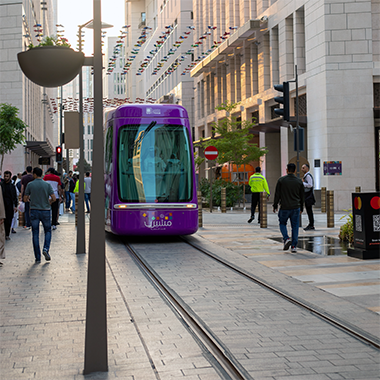
The above note was written some time ago, since when a rail or tram system is now in place in Doha and was used successfully during the 2022 World Cup series in order to cater for the extremely large numbers of visitors to the State.
Of course it was not only for the World Cup that the trams have been introduced, they represent one element of the transport policies to move people around the country, it being anticipated that not only will visitors and expatriates use them, but also Qataris. What is seen to be an imperative is to reduce the numbers of cars on the roads, particularly during rush hours, though it is realised that people like to have personal control of their movements, particulalry within the controlled, personal space which a car affords.
These trams are painted a strong purple colour in order that they can be highly visible within the pedestrian urban area in which they operate, this one having ‘musheirib’ painted low down on its front and serving downtown Doha.
Air
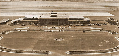
By the 1970s, an international airport had been established on the east side of Doha in order to deal with the increasing numbers of travellers needing to come and go from Doha, travel which reflected the growing business importance of the State. Most of the necessary facilities of the airport were contained within a single structure as can be seen from this old photograph of the airport. In the foreground is the car park and, behind the airport building is the hard-standing and taxi-way and, behind that, the main runway. On the roof can be seen a shaded area which, together with a covered lounge, enabled visitors to the airport to see travellers coming and going. This was a very popular facility, particularly in the evening when work was finished for the day, attracting thousands of visitors and, because of this, eventually causing the facility to be closed down.
Facing east north-east, the main building of Doha International Airport ran parallel to the runway which was oriented approximately north north-west in order to take advantage of the shamal, whose direction is relatively constant.
Pressure on the airport both for freight and passengers escalated rapidly, requiring the facility to be expanded in the 1980s and the VIP facility to be improved in the 1990s.
During the 1990s plans were discussed to increase it again or, better, to construct a new airport. Designs were made and considered but financial constraints tended to prefer incremental improvements rather than see the development of a new airport. However, since then there have been significant increases in the pace of development and this has now seen plans being considered to upgrade the facility significantly.
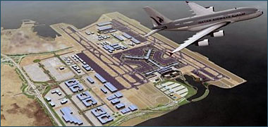

The upper illustration to the right shows how the existing runway is being planned to reach into the east bay of Doha. The existing runways impacts the recreational and other facilities at present located in the West bay but the new runway structure has been placed to the east of the existing one on filled land, covering an area of land that has never been properly utilised due to the airport cutting it off, the only access being at its north end, past the power station at Ras Abu Aboud, or from the south, an access off the Wakrah road to the old refuse dump. The lower photograph shows the new reclaimed area with the runways under construction towards the end of 2008. The alignment, incidentally, is almost directly into the shamal, approximately from the north-north-west, and is parallel with the existing runways to its east.
From a structural point of view, the airport is located very near to the centre of gravity of development in the State. Its location to the east of Doha serves Doha with its proximity to the capital being one of the closest relationships of airports and the city they serve. Direct access to the south of the country is made through Wakrah to Umm Said, the industrial city; round the ‘C’ and ‘D’ ring roads to access Umm Bab and Dukhan through Rayyan; and the north along the North Road, itself an extension of the ‘D’ ring road. The Corniche also enables goods to be moved into the New District of Doha, though it was always intended that it would be the ‘A’ and ‘B’ ring roads that would act as the distributors, safeguarding the Corniche for more recreational and ceremonial activities and transportation.
First developments
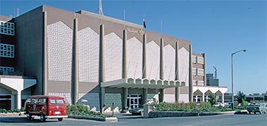
It’s difficult to argue for a logical starting point of the first large scale developments in Qatar as there have been large constructions since the 1950s and 1960s. I’ve made the arbitrary decision to begin these comments in the 1970s but think it sensible to mention first one or two buildings that were important fixtures of the urban landscape of the 1960s and early 1970s. These buildings included Government House, the Grand Mosque, the Guest Palace at Rumaillah, the Oasis Hotel and the airport, for instance, as well as buildings associated with the military and oil industry.

The photograph above is of the front entrance of the Oasis Hotel. Its south-facing façade was covered in a pre-cast concrete mushrabiya screen in order to give some protection against solar gain. Situated on the Ras Abu Aboud road it was considered in the 1970s to be one of the more important buildings in Qatar. This photograph shows something of the character of the interior public spaces.

From the sea, the Oasis hotel had a very different look, there being no reason to have mushrabiyaat screening to protect against the sun. Looking north, its rooms all enjoyed balconies as can be seen in this photograph from the sea. In front of the hotel, bottom left and on the shoreline, was the Beach Club where there were two squash courts as well as the Doha Sailing Association with its fleet of Laser class racing sailboats. The building on the right was in private ownership as was the site to the left.
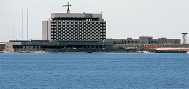
Also from the sea, and taken in 1972, this photograph shows the Gulf Hotel, a little further east along the Ras Abu bout road which opened, I believe, in 1973. The construction responded to a need to provide for the considerable increase in visitors wanting to do business with the increasingly attractive State and, in so doing, bring higher standards of hotel design to the country.
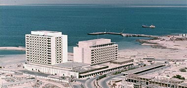
With the change of government in February 1972, the State became rapidly aware of the shortage of suitable accommodation not just to cater for the professionals, middle management and workforce needed to work on the government’s infrastructure projects, the private sector also required accommodation for those developing the business opportunities, necessary and envisaged. Because of this the Gulf Hotel was significantly enlarged by the addition of another block to its west around 1975.
The shortage of hotel accommodation continued for some time with many smaller hotels opening more central to Doha. But in February 1982, the iconic Hotel and Conference Centre was opened on the point of the New District of Doha creating a dramatic focus to views across the West Bay.
It has also been difficult encapsulating developments under sensible headings. The notes here also deal with a similar area of the State’s development.
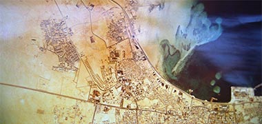
But a major initiative was begun in the early 1970s with the decision to clean up the West Bay and create a significant area of land in which the Government could build, and encourage the private sector to build, new constructions that would set a standard for future projects. Prior to that date, as you can see from the accompanying aerial photograph, the West Bay was constrained by low sand banks that were moving south and which inhibited the natural cleansing of the bay by waters from the Gulf. The islands of al-Safliyah and al-Aylia were also constraints, being located a little way off the east coast and north of the photograph.
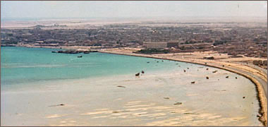
This photograph was taken in May 1974 looking south-east back towards Doha. The large building was demolished to make way for the present Diwan al Amiri; the old Diwan al Amiri is hidden behind it and the Ruler’s Jetty is visible. The main port is out of picture to the left and feriq al-Bida is on the right. You can see the small fishing boats lying at low tide, but even at high tide there was not much depth beneath even the smaller craft’s keels. They were, however, an attractive view along the littoral and the road leading to al-Markhiyah and Medinat Khalifa.
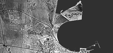
The outline of the West Bay was delineated relatively quickly, its form based on two simple geometric arcs almost describing a circle. Although it is not shown on this photograph, a relatively hard area of rock was left more or less in the centre of the bay, the intention to locate there a feature, at that stage, yet to be defined. To give an idea of scale, it is around 2.8 kilometres from Doha’s dhow jetty to the Hotel and Conference Centre.
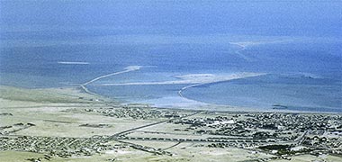
This oblique aerial photograph, looking more or less north-east, was taken a little before the black and white photograph above. It is included as it gives a better understanding of the relationship between the area to be filled and the island of al-Safliyah to its north, the tail of the island trailing south towards the West Bay. The photograph also gives some understanding of the shallows around that area off the east coast of the peninsula. The island of al-Aliah is north of al-Safliyah, but not visible in this photograph.
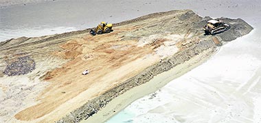
Work proceeded rapidly with the Taxi Association, whose owners ran lorries as well as taxis, beginning to fill the outline with rocks brought in from the desert. These were dumped in two arcs, seen in the photograph above, that defined the area in which it was intended that dredged fill from the bay would be dumped to create the New District of Doha, sometimes, and unfortunately named, the dafnah.
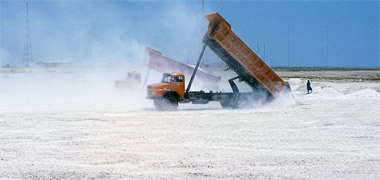

Although the Taxi Association were initially employed to construct the bunds that would retain the dredged saline fill, they continued to work the area in providing desert fill to the areas furthest away from the coast. In the top photograph, two of their lorries can be seen working with the Markhiyah transmitter towers in the background.
The stones they carried and placed came from government controlled quarries in the peninsula where suitable material was accessible. One of the characteristics of the peninsula is that its limestone is relatively soft and, when placed in contact with sea water, can be broken down, a problem that was particularly relevant with the construction of sea barriers on the Corniche when the concrete units, constructed with soft aggregate, were found to deteriorate rapidly. Nevertheless, the majority of aggregate used in government construction projects, comes from government controlled quarries where, as is seen here, protection is provided by the military.

While the Taxi Association was able to begin its work swiftly and create bunds or embankments for the edge of the fill, it took a little while to contract a private company to provide the dredger necessary to take out the sea bed and provide fill to the bunds. This delay was useful in that it allowed much of the bund system to be created prior to the arrival of the dredger. This photograph is of a crane barge used in moving large equipment around.
In various parts of the Gulf there were dredging operations in progress as the different States sought to improve access to their harbours. This type of work had been necessary both at Umm Said where deep water tankers needed to be able to access the oil terminal as well as at Doha where freighters had to be able to access the port facility that had been expanded between the East and West Bays. The Overseas Dredging Company, a subsidiary of the Westminster Dredging Company, had been engaged on the latter activity since 1961 using the bucket dredger, ‘Goodworker’.
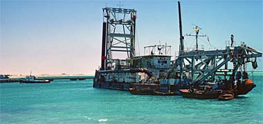

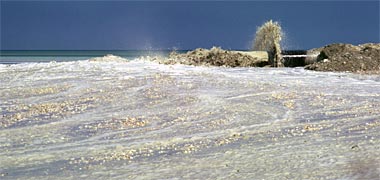
Boskalis Westminster (Middle East) was employed to carry out the reclamation of the New District of Doha, their work beginning in 1974 using a cutter suction dredger, the ‘W.D. Enterprise’ belonging to the Westminster Dredging Company. This vessel moved around the West Bay trailing its pipe that led the fill directly onto the area defined by the previously constructed bunds, graders and bulldozers being employed to level the area to the necessary profiles and thus create the New District of Doha on which the State would construct high quality development both for itself as well as encouraging the private sector to take advantage of this prime location.
Above, the first of these three photographs shows the ‘W.D. Enterprise’ moving between work stations in the West Bay, a feature of the bay for a number of years. The aerial photograph below it shows the dredging operation pumping through a booster station to what would become the site of the Hotel and Conference Centre. Designed to sit on an elevated position the development required the construction of a small hill. The third photograph is of the end of the pipework showing the fill being deposited onto the landfill awaiting levelling by the graders and bulldozers.

The result of this project saw the development of an important State resource, a large body of land in government ownership which was now available to seed new development at significantly higher standards than obtained at that time in the peninsula. This photograph shows the distinctive shape of the West Bay with the port on the right, and the beginnings of the road system, notably the Corniche and the continuation of the ‘A’ Road moving into the New District of Doha. The island of al-Safliyah can be seen at the top left of the photograph. In the centre of the bay is a small island that was left as it was comprised of relatively hard material, and it was thought it might sensibly be left to form a focus or feature in the centre of the bay.

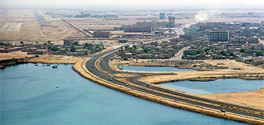
So far this note has focussed on the West Bay and the development of the New District of Doha. But other works were in progress around Doha as the infrastructure was installed and expanded in line with the plans being developed by consultants brought in to sort out a strategy for the rapidly growing conurbation. On the east side of Doha, to the east of the main port, the Corniche was extended to become an integral element of the ‘C’ Ring Road running south of the city.
These two photographs, looking approximately south-east and south respectively, show the Corniche running past feriq al-Salata and, south of it, feriq al-Hitmi with feriq al-Khulaifat to the east, on the left of the photo, beneath the north end of the old runway. The old palace of Sheikh Abdullah can be seen on the right hand edge of the first photograph. The Corniche here was, like the line of the West Bay, determined as a relatively simple curve and created by dumping desert fill. The areas of sea left inside the road were filled with a variety of materials but, adjacent to the old Palace – now being developed as as the Qatar National Museum – a lagoon was left in which it was intended that country craft would be displayed.

This development, south and east of the centre of Doha was coaeval with the construction of the New District of Doha and was intended to give balance to Doha. It opened up not only these two districts, but also the area north and east of the runway towards Ras Abu Aboud where the desalination plant was situated and where the Gulf Hotel was constructed a little way past Doha’s, then, premier hotel, the Oasis. The Doha Club was also located later on in that area, just off to the left of this photograph which shows the Oasis hotel in the foreground and the Gulf hotel on the right.
Other, larger, projects continued to develop such as the Gulf Hotel, but work associated with the planning and development of the New District of Doha took benefit from the considerable funds now being received and this, in turn, established standards for development elsewhere in the country. The project that established intent within New District of Doha and set a standard for development design and construction standards, was the Hotel and Conference Centre; located on the far corner of the newly filled dafnah, it was designed to be a focus for the cleaned out and reshaped bay.

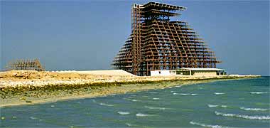
The main construction contract was let to the Korean firm, Hynudai Engineering and Construction, and three thousand concrete piles driven down to the bedrock on which the project was constructed. Their sub-contractor, Kawada, provided and installed the steel framework for the Hotel and Conference centre. A local company, Reliant, was the mechanical and electrical contractors. The work was carried out safely and in an exemplary manner as this first NDOD project was extremely prominent and had to allay concerns that many had for developing on an area that had recently been sea. The first of these two photographs shows the work in progress from what would become the restaurant at the top of the building. The island of al-Safliyah can be seen on the right. The second photograph, also taken in Autumn 1978, shows the framework virtually complete and awaiting the next phase of work, the cladding of pre-cast concrete units.


The pre-cast units, manufactured by the Dutch company, Interbeton, were relatively thin and required good material and considerable skill in their casting. As can be seen from the first of these two photographs, the units were hung on the steel frame, the curved unit being the shade panel that was designed to shield the windows from direct solar gain as well as provide a degree of comfort to those using the balconies. Its curved shape also facilitated the long span it covered. In the lower photograph you can see a single unit, temporarily propped during the fixing process. The lower photograph also illustrates an important feature of the hotel design. Unusually for hotels, the rooms are designed on two levels with the beds at the higher, entrance level, and the sitting area associated with the balcony. This device focusses views down onto the sea and surrounding land, taking advantage of the importance this has in the siting of the building.
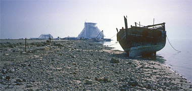
Ever since the form of the hotel was established, the development has been an iconic focus to the development of the New District of Doha. In this first, perhaps romantic, image something of the spirit of its presence can be plainly seen with the hotel in the distance, and one of the country craft, a jaliboot sitting on the shore in the foreground prior to the Corniche being developed.
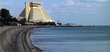
Designed by C.Y. Lee of William L. Pereira Associates, an American company known for their iconic buildings, the novel design established a character for the new area through its external form and internal arrangement. Pyramidal in shape, the building contains a twelve storey volume which forms a meeting point for those living in and visiting the hotel. In this sense the atrium acts very much in keeping with the character of a traditional khan, an environmentally protected space with rooms stacked around it.
At first glance it might be thought to be very much a Western design which, of course it is. However, I believe its conceptual design in terms of the central atrium, its deep-set solar-protected fenestration and its geometric character make it an intelligent response to designing both for the Arabic / Islamic setting in which it is established, as well as for the climate and use. The Hotel and Conference Centre were officially opened in February 1982.
At the same time the first government building was constructed closely followed by the first of the embassies for the Diplomatic area, as well as the first commercial project and the first residential buildings of the Senior Staff housing, the latter with its own development office, staffed by young Qatari graduates controlling the designs of these houses.

This photograph, taken looking north-east, illustrates a part of the Diplomatic Area within the New District of Doha. Diplomatic sites were distributed by lottery and placed each side of a looped distributor road. Some Missions took sites on both sides of the road, some only on one side, the sea side being favoured. Those Missions which took two sites located their Residence on the sea side in order to benefit from access to the sea, and siting the Embassy on the land side. Those which took one site located their Embassy near to the road, with the Residence behind it, both within the same site.
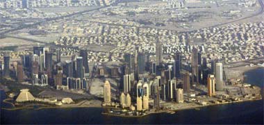
Security to the area, in principle, was provided at the two ends of the loop, ensuring that only legitimate visitors were allowed in. There are significant security issues with the development of Diplomatic areas which I won’t go into here, but they are, nowadays, a very specialised branch of both architecture and planning. One of these issues, which is obvious to all and which can be seen in this photograph, looking north-west, is the overlooking from the tall buildings sited to the west of the Diplomatic area which can be seen on the right of the photograph.
To the north of the New District of Doha, the Qatar University was constructed in the late nineteen-seventies. Politically it marked the State’s intention to provide tertiary education for both its nationals and expatriates, a necessary first step in creating a cadre from which to develop its workforce. Architecturally it was intended to demonstrate an Islamic architecture based on traditional building in Qatar, or at least the Gulf.
On plan its novel design comprises octagonal units – approximately 8.4 metres wide – linked by square units – approximately 3.5 metres square. On top of the octagons are pitched roofs on which are mounted notional wind towers or units intended to give light to the space below while softening the harsh lighting conditions. There are virtually no windows to the outside world, again based on local traditions, themselves reflecting not just privacy and security but the need to ameliorate lighting and ventilation to the interiors.
At the time of its construction the University was well thought of architecturally, winning a number of awards for its designer as one of the first complexes which could be thought of as Islamic in character. Despite this, there have been a number of issues arising in operation, some of which should have been foreseen.

The university is dramatic in appearance, the drama to a large extent being established by the repetitive nature of its architectural vocabulary. This first illustration is of the library block and shows the use of the ‘tower of light’ units, mounted on top of a two- and three-storey plan. Constructed on a rise in the desert the broken skyline adds to the drama, particularly when seen from its lower, southern approach.
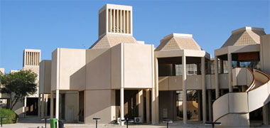
This second photograph illustrates the feature which is more related to traditional architecture, the wind tower unit; it also shows the open nature of some of the units forming connecting units and atria. The construction is also evident in these photographs. Following a significant period of development and testing, the pre-cast concrete panels were constructed on site and lifted into place to form the structure of the development. It was an important project to get right and benefited from having Ove Arup as engineers to translate the architect’s concept. While this project had relatively heavy concrete units, the hotel and conference centre used relatively light units on a steel frame.

As I mentioned earlier, there are problems with the design caused by the basic decision to create a two storey structure with a wind tower over it. Obviously air can not get to the lower level, in addition to which the University’s position north of Doha means that there is nothing to reduce the effects of a dust or sand laden shamal. This has meant that the wind towers really can’t function properly though the space below them is attractive and usable. I should also point out that, where an octagon and square are joined there is a considerably sized space created.
Walking around the building it is considered that the ground floor ceiling height seems relatively low compared with the first floor. At about three and a half metres it shouldn’t be but, as I have mentioned elsewhere, Gulf Arabs like high ceilings. A more serious problem stems from the basic geometry where the octagon and square module creates problems with the sizing of spaces and the organisation of circulation routes. This is a problem when a rigid geometry governs a layout where relationships are likely to require significant flexibility.
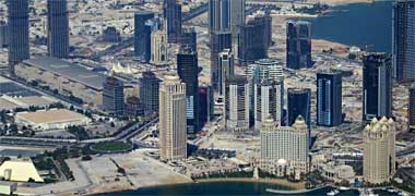
This photo was taken in Autumn 2006 and shows the extent to which the end of the New District of Doha had been developed by that time. The Sheraton Hotel is just out of shot on the left though the truncated pyramid of its Conference Centre can be seen. The outline of the coast has been amended from the original plans between it and the Dipomatic Area – the two storey coastal developments to the right – and a hotel complex and marina added.
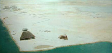
The above can be compared with this photo of the beginnings of the New District of Doha in the mid nineteen-seventies. The Hotel and Conference Centre was the first complex to be built in the New District and, here, can be seen under construction, the hotel on the left, the conference centre to the right. This was closely followed by apartment buildings designed by Georges Candilis which can be seen in the background and then Salam Plaza. A similar project by the same architect was developed contemporaneously at Umm Said. The area just off to the right of this photograph was established as the Diplomatic Area and a small number of Embassies and their residences were constructed there. At the same time the conceptual designs for Qatar University were developed by the architect, Kamal al Kafrawi, assisted by Ove Arup and Partners.
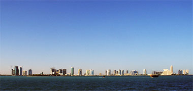
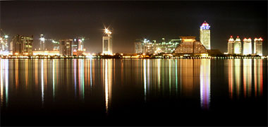
You can see that a significant amount of development has been constructed in the New District of Doha and that the skyline has changed dramatically over the last decade or so. Bear in mind that the New District was only created in the 1980s. The Hotel and Conference Centre on the point of the reclaimed land was, for a long time, the most significant development creating, with its pyramidical shape, a readily recognisable feature marking the extent of the development. Now, seen across the bay, day or night, it is far less significant than it was, though still a beautiful shape seen against the profile of the bay and sky. The third of these four photographs show it from the sea, looking north-west, with the new development to its north. The white truncated pyramid to its right is the Conference Centre. As you can see in the lower photo here, the New District of Doha also forms an attractive panorama at night.
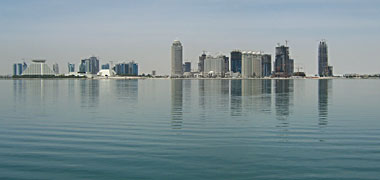

The lower of these two photographs can be compared with that above it, which was taken from the sea, east of the New District of Doha. The lower photo, taken from the aiport along one of the runways, looks at the New District of Doha from the south-east. The sloping flank of the Sheraton Hotel can just be made out to the left of the runway, and its oversailing restaurant can be seen jutting out above it. Again it is interesting to see how the higher developments to its north have subdued the importance of the Hotel and Conference Centre from views across the city. Its shape and location were intended to form a visual marker at the turning of the bay. Despite the background development it still, however, retains its visual urban design importance when viewed from the Corniche across West Bay.
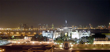
Here, the view is taken north from Doha over the Rayyan Road and the new Diwan al Amiri in the foreground and with the New District spread behind it. The old Diwan al Amiri is attached to it and is located to its east – right – out of picture. Incidentally, within the boundary wall you can see two reconstructed, traditional buildings. That to the left of the entrance is the building in which the previous Ruler, Sheikh Khalifa bin Hamad Al Thani, was born.

And here is an image of the commercial development of the New District of Doha taken in May 2009. Looking from the high ground to the north-west of the reclaimed land, the new developments make an interesting panorama over the, generally, two storey residential buildings in front of them. The Sheraton Hotel can’t be seen at this scale as it is hidden behind the commercial buildings just left of centre in the photo. The photograph gives some indication not only of the amount of new development, but also its character and scale as will be seen from the link.

The surge of development in the 1970s also saw the construction of the first major multi-sports stadium. Constructed some way to the west of Doha it was intended to be the location for a variety of sports, drawing international events to it with its ability in being able to accommodate the larger crowds now anticipated to attend such both national and international events, the National Sports Stadium at feriq al-Hitmi or al-Rufaa’a – (there seems to be some difficulty in naming this area correctly), photograph below – no longer being considered suitable in terms of its accommodation and associated parking within a residential area of Doha.
Coming developments
It is not possible for this site to deal with all the new developments planned or proposed for the peninsula. As a consequence these notes should not be considered to represent future developments, but only a handful that may not even be representative in scale or character. Some proposals may never go ahead, and some may already exist. Please do not take these notes as representative or complete in any way.

These pages may give the impression that the old buildings in Qatar have been swept aside with a variety of modern structures taking their place. It would be anticipated that these new buildings should have a normal life of at least thirty to forty years, more if designed intelligently. But the reality is that buildings that appeared to be modern and fulfilled the requirements of their owners just a few years ago, have become out of date rapidly, perhaps even a liability. Put another way, the land on which they sit has increased in value so much that it is a better use of of the land to knock down the recent structure and replace it with a more modern and larger building. The equipment demolishing this structure shows that it incorporated a significant amount of reinforced concrete, apparently both in-situ and pre-cast. I don’t know what will replace it when the demolition and associated work has finished preparing the ground, but undoubtedly it will be larger and, hopefully, an improved design.

This photograph dates from September 2006 and graphically illustrates the extent to which the New District of Doha has developed over the last thirty years. The Sheraton Hotel and Conference Centre can be seen in the foreground, the Corniche beginning just out of picture on the left behind the triangular park. Some of the office block projects, completed and under construction, can be seen to the north-west, behind the Hotel and Conference Centre. Further back there is Senior Staff housing and, just out of sight on the horizon, is Medinat Khalifa and its public housing adjacent to the road leadingn to the north of the peninsula. The photograph gives a good cross-section of projects illustrating the character of development in Qatar.
I have written elsewhere about the development of Dubai, one of the United Arab Emirates south-east of Qatar. Claimed to be the largest building site in the world there is a massive amount of consruction work in progress. The range of architecture is interesting to see as, in many ways, it appears to mirror the character of the architecture that is coming about in Qatar, albeit on a much grander scale and with several years’ head start.
Here I am placing six developments I learned about on the Qatarliving site. They are in the process of development and, according to the site, are likely to be constructed in the near future. I have to admit that, at the time of incorporating them, I don’t know where they are to be situated.

From left to right in the top photograph there is the forty-three storeys Bidda Tower, Burj Qatar – literally, Qatar Tower, and the Zigzag or Lagoon towers.
From left to right in the lower photograph there is the Burj al-Ta’min, the Burj al-Nakhla, and the Burj Dubai in Doha which, I assume, is a smaller version of the building that has become very much a symbol of Dubai, used by that State in its international advertising.
There is certainly an emphasis now on tall buildings, specifically towers. Here are three projects by the same architect, Roger Taillibert. The image on the left is that of the fifty-seven storey Kubaisi tower. The centre two images illustrate day and night shots of the three hundred metre high Khalifa Olympic Stadium tower, with that on the right being a later development of the same project. The tower incorporates a two hundred bed hotel and other facilities.
There are, however, many more developments planned for Qatar. An overview of some of them can be seen on the urbanplanet.org site where there seems to be the incipient view that Doha will rival Dubai. As and when I am able to obtain permissions, I will place them here.
This photo of the model of a projected scheme is of the Burj Tower to be constructed in the New District of Doha. Designed by Jean Nouvel it is based on the design of the Tour Agbar in Barcelona and is a development of the interest the architect has in designing towers significantly different from the traditional concepts which govern most towers. Here the architect wishes to move away from the orthogonal, central-cored, curtain-walled scheme and develop an architecture which is circular on plan, and has the structure on its periphery incorporating devices for dealing with solar loading.
There are significant advantages in this conceptual approach. A peripheral structural system leaves the centre of the building free of columns, giving the client more control on the placement of partitions and the organisation of the internal lighting. This results in a more rentable building as well as one which has more opportunities to respond to a variety of different clients’ requirements.
The building is designed as a cylinder of 45 metres diameter at its widest, and incorporating an internal atrium to 112 metres – the twenty-seventh floor. Its dome is completed by a light tower at 231.50 metres and its overall effect has much to do with the simplicity of its shape and the detailing of its façade. It is a building that deserves to have surrounding space in which to be seen.
The structure is a steel and concrete diamond grid following the surface of the cylinder. The façade, as can be seen in these two details of the model, is formed of double skinned aluminium elements of different scales which will additionally create interest at different distances. This detailing, together with the form of the structure, has much in common with traditional Islamic geometric design and, as such, demonstrates that modern buildings may use traditional elements in their design to good effect.
I should emphasise that this is not applied design or pastiche but an integrated solution to the problems of conflicting requirements of views out and solar loading on the building. The pattern of the lattice varies according to the orientation and needs for solar protection. The lattice provides 25% protection to the north, 40% to the south, and 60% on the east and west. The inside skin has a reflective treatment in order to provide the calculated solar loading.
It might seem from these notes, and from the evidence of what is actually being constructed, that tall towers are the best way to provide the architecture that will contain the different uses in the newly developing areas of the Gulf.
The two chief reasons why tall buildings are being constructed – in planning and architectural terms – are to permit greater worker density and provide recognisable, iconic buildings, neither of them being a particularly Islamic way of developing. The architect and critic, Koolhaas has referred to skyscrapers as a ‘hideous, mediocre form of architecture’ and demonstrated in his new complex for China Central Television, a massive structure of over 400,000 sq.m. which, he argues is a hyperbuilding, one which should replace tall towers by producing a more communal form of architecture. His main argument is that the densities achieved by towers can easily be produced at lower heights and, in doing so, will produce more integrated developments which will be more suited to modern societies.
Tall buildings are not a new invention. National and international competition to produce ever taller structures has been facilitated by technological improvements in materials, techniques and systems which have led to changes in the ways in which these buildings are conceptualised, designed and constructed.
For instance, one of the most difficult problems to deal with in skyscrapers is escape in the event of fire. There is a limit to the number of lifts and cab sizes that can be employed to move people in and out of a building. The higher the worker population the longer it takes to populate or depopulate the building. While phasing working hours can help, there is an obvious correlation between the floor space taken by the lift system and the remaining leasable floor area. This relationship is important to those funding the building and intending to maximise, or at least optimise their return. These two issues have seen the development of two-storey lifts, lateral thinking which has improved the rates of entrance and escape from tall buildings. But the Burj in Dubai has another conceptual change. In the event of fire, some of the floors will empty their personnel not into the escape system but into spaces given additional protection where they will wait for the fire-fighters to carry out their work and then lead them to safety, in effect extending the length of time to escape to safety. How this will work psychologically is not clear, but it certainly marks a different approach to the design of tall buildings.
Other considerations such as those for the dead loads of the building, wind loading and building movement, earthquake consideration, heat on materials, and so on are heightened with tall structures and have additional ramifications for maintenance, security, running costs and the like. Similar considerations are given to lower buildings, though they are not as complex as with tall buildings, the organisational requirements and issues relating to change in use generally being more complicated.
Skyscrapers are relatively easy to locate, fund and build as their floor plans tend to be simple and easily repeatable, and their façades a relatively easy exercise in architectural styling. That may seem unfair as many buildings are now designed with an overall three-dimensional form driving their image, work which can be accomplished relatively easily now that computerised design is commonplace. While communal architecture is more difficult to organise without a strong central, directing body, it certainly has a parallel with the traditional planning of Arab towns where the tight integration of communal living was brought about by the twin influences of Islam and the harsh environment.
The closest modern development to this philosophy is that of the planned masdar City in Abu Dhabi, which is intended to be zero-carbon, zero-waste and car-free. Not only does this development replicate many of the features of traditional Arab urban development, it is planned as a sustainable development, this being the manner in which professionals are now beginning to consider projects in the region.
The Masdar City project focusses on what is termed the ‘One Planet Living principle’ which is established on ten principles:
- Zero carbon – 100% of its energy is to be supplied by renewable energy from photovoltaics concentrated solar power, wind, waste to energy and other technologies,
- Zero waste – diversion of 99% of waste from landfill by waste reduction measures, the re-use of waste wherever possible, recycling, composting and waste to energy systems,
- Sustainable transport – zero carbon emissions from transport within the city, and the implementation of measures to reduce the carbon cost of journeys to the city boundary through facilitating and encouraging the use of public transport, vehicle sharing and the support of low emission vehicle initiatives,
- Sustainable materials – by specifying high recycled materials content within building products, tracking and encouraging the reduction of embodied energy within material sand throughout the construction process, specifying the use of sustainable materials such as Forest Stewardship Council certified timber, bamboo and other products,
- Sustainable food – with retail outlets meeting targets for supplying organic food and sustainable and/or fair trade products,
- Sustainable water – through reducing per capita water consumption by at least 50% of the national average and re-using all waste water,
- Habitat and wildlife – to be conserved or relocated with a programme of positive mitigation targets,
- Culture and heritage – with the architecture integrating local values,
- Equity and fair trade – being achieved through fair wages and working conditions for all workers, including the construction workers, as defined by international labour standards, and
- Health and happiness – facilities and events being provided for every demographic group.
As you can see, this is an extremely ambitious list, though one that can easily be seen to incorporate and represent Islamic values.
But what seems to be more interesting is that, if this trend towards sustainable development continues, the buildings which have just been constructed in the region – and many that are in the process of development – are likely to be the subject of retro-fitting sustainable systems in order to improve their performance in the changing world. We are likely to see, then, continuing construction work on many of the tall buildings now developing and developed in the New District of Doha due to their value in iconic terms: an interesting development for the future.
Doha Bay crossing – Sharq

One of the most ambitious projects to be seen in Qatar, certainly from an engineering point of view, is the Doha Bay crossing which – at the end of 2013 – has been initiated with a view to completion by 2020. A note on its development as a means of improving the road infrastructure capacity and distribution capability has been made on the page dealing with the peninsula’s traffic distribution system, and which might be usefully read along with this note.

The project has been designed as an infrastructional road scheme, but has a significant presence due to its design by Santiago Calatrava, who has created a number of important bridges. But it is not just a bridge system; it is both a system of bridges and tunnels, the bridges being associated with the landing or take-off points from the existing shore lines to the east and north of Doha, and the tunnels ensuring that it continues to be possible to see the waters of the Gulf.

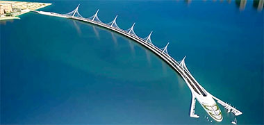

This view of the bridge immediately north of the Hotel and Conference Centre and seen from the Corniche, illustrates the scale of this bridge compared with the thirteen-storey hotel. Each of the bridges has a different design and character and give identity to the points at which the land meets the sea when viewed from the Corniche. In a real sense they will frame the views of the Gulf from the city, particularly from the Corniche.
The second illustration is an aerial view of the northernmost bridge showing it to be around a kilometre-and-a-half long before it moves off the surface and into the tunnel system, linking with the Hotel and Conference Centre tunnel on its way to the development east of Doha at Lusail. At its point of submerging there are intended to be a collection of support facilities incorporated into a structure which has associations with the superstructures of sea liners.
This final view of the project looks over the bridge situated on the east edge of Doha and connecting the Lusail area with the New District of Doha and Pearl to its north. The buildings of the New District of Doha development can be seen on the left with its bridge just discernible left of centre.
Sports stadia
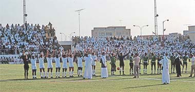
A national sports ground was established in the late 1950s, its purpose being to hold not only sports events, particularly football, but rallies and suitable demonstrations such as by the scouts, military and police. This photograph, taken in February 1973, shows the line-up for a match between Qatar and Brazil at which Pélé played. It also illustrates something of the limitations of the stadium in terms of its capacity and the proximity of the surrounding residential accommodation situated in the east of Doha.
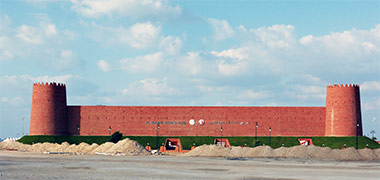
But the peninsula also witnessed the development of football pitches associated with the clubs that have been important elements of the areas in which, particularly, nationals lived. Increasing wealth has seen these pitches develop as the clubs themselves have benefited from local interests. There are now a number of stadia around the country where locals engage in a variety of sports activities, notably football, supporting fourteen main football clubs. This sports ground, the Shamal Sports Club situated south-east of the centre of al-Ruwais, illustrates some of the vocabulary, based on local traditional architecture, that drive many architectural projects.
The award to Qatar as the setting for the 2022 World Cup has created the requirement for larger stadia to accommodate the anticipated numbers who will watch the competition. Realising that there will be a discrepancy between the sizes of these stadia and subsequent spectator numbers, most of the stadia will be designed to allow partial dismantling at the end of the matches, with those elements being given to poorer countries. This is likely to apply to other facilities created for the events.
Much has been written about the Fifa World Cup 2022 to be held in Qatar. Scheduled to begin on the 21st November with the final being held on the 18th December 2022, the process for identifying the numbers of stadia and their location appears, in October 2015, to be settled. There are likely to be eight stadia used for the competition:
Name |
Situated at |
Nominal capacity |
| Lusail stadium | Lusail | 86,250 |
| Sports City stadium | west of Doha | 47,560 |
| Education City stadium | north of Doha | 43,350 |
| Al-Khor stadium | al-Khor | 45,330 |
| Al-Wakrah stadium | al-Wakrah | 45,120 |
| Al-Shamal stadium | Medinat al-Shamal | 45,120 |
| Umm Salal stadium | Umm Salal | 45,120 |
| Doha Port stadium | Doha | 44,950 |
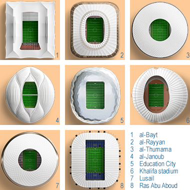
though it is possible that the number of stadia will change, and that the numbers of seats are likely to vary from those given here. The FIFA bid was made on the basis that there should be at least eight stadia available for the competition, but the twelve initially announced by Qatar are unlikely to be constructed for the games.
By October 2015, six of the locations for stadia had been identified, but only four designs had been published. The schemes for the sites at Sports City (al-Khalifah), al-Khor, al-Wakrah, Education City, Lusail and al-Rayyan are moving forward with the intent of having them all completed by 2020. This graphic of the eight stadia shows the eventual agreed stadia that were to be constructed. More information on each of them is to be found at one of the Planning pages.
May 2017 has seen the first of the stadia announced ready to accommodate the FIFA Football Games. Situated at al-Waab and with a capacity of something over 40,000, Khalifa International Stadium has been officially declared open at the hosting of the Final of the 2017 Emir Cup. Khalifa International Stadium was first constructed in the mid-1970s but has been redeveloped a number of times since then. There is an image of it further up this page.
The other stadia, stated in May 2017 as being planned for completion for the 2022 Games, are al-Rayyan, al-Wakrah, al-Bayt al-Khor, Qatar Foundation, Lusail, Ras Abu Aboud and al-Thumama.
A little more will be written about the stadia on one of the planning pages, though this is likely to direct you to other sites where there is more information on the individual stadia.
Floating hotels
In December 2010 it was announced that football’s World Cup would be hosted by Qatar in 2022. As noted above it was immediately apparent that there would be a need to buttress a number of elements of the peninsula’s facilities in order to accommodate the significant numbers who would come to Qatar. Estimates of the numbers likely to need accommodation at that time have been made, but it is likely to be impossible to make a more accurate estimate until very shortly before the events due to a variety of issues, environmental, operational and political being among them. What is certain is that there are at present insufficient hotel rooms available and that additional accommodation will have to be provided, at least in the short term.
The Qatar National Vision 2030 strategy, announced in 2008, envisioned developing elements of its sports tourism destination planning over the next decades. However, in providing facilities for international sports events the state has understood that for some sports, building more permanent hotels is not necessarily the best use of resources. Where sports attract a significant number of spectators with competitors, their support staff and specific requirements, there may be a significant number of rooms surplus to requirements following the completion of those sports.

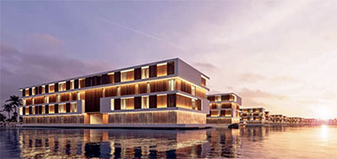
One of the initial solutions that were suggested to resolve the difficulty of housing the large numbers of spectators anticipated to attend the football games and requiring hotel accommodation was that suitably sized ships might be converted in order to fulfil this short term need. In considering a marine-based solution, a more suitable proposal has recently emerged from a Finnish company. These two aerial and water-side illustrations envision the provision of a number of custom-designed, four-storey floating hotels. The designs are comprised of modular units that would be constructed within the controlled environment of a purpose built factory. Each of the units would house 101 guest rooms along with a restaurant and lounge bar in a floating structure 72 metres long and 16 metres wide. The draft of the structures is four metres.
Marine structures are argued to be a novel and more effective solution to the housing of large numbers of visitors during the relatively short period during which the games will be held in Qatar. It is envisioned that, following the competition, there would be a variety of possibilities or opportunites for these craft being removed either to different locations around the pensinsula or elsewhere, or even dismantled and used for a variety of other purposes.
The suggested location for this proposal of sixteen floating hotels is Qetaifan Island, part of the Lusail project north of Doha. The island is to be the location of other recreational facilities. It will be interesting to see how this project proceeds, particulalry with regard to the landside facilities needed to support the day-to-day short-term activities relating to the floating hotels.
A private residence
Many of the notes on these pages relate to buildings that have already been constructed although, on the page that looks at planning in the peninsula, there are a number of major projects illustrated in their design stages. However, there are other projects of a smaller scale being developed, and the one illustrated here appears in many respects to be a radical departure from the character of architecture being developed in the peninsula. For that reason it deserves a brief note.

The project is a private residence, a single storey house that will be located in a desert location where it will be surrounded by heavy planting in order to obscure it from the surrounding desert and provide a curtain of privacy. The site will also include a private zoo.
While the building is a residence, it will not be in full-time occupation as the owner plans to use it for a few days each month. This factor alone significantly changes the way in which the scheme should be viewed, though it must be added that, because of this, it is also not possible to understand how it will be treated when it is not occupied by the owner. Nor is it known how many of the client’s family and friends will use the house, again a factor complicating the way in which the project is viewed.

The floor plan typology shows the house to be designed notionally as a introverted courtyard house though, unusually, having considerable glazing to both its external and internal walls where there would traditionally be masonry. The privacy normally established by this character of traditional design is here to be provided by the surrounding trees together with a closer positioning of movable screens on the outer rim of the projecting roof, although not shown on either of the illustrative perspectives below.

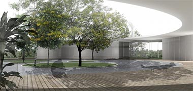
Insulation of the house is to be provided by planting the roof – a feature that will coincidentally improve the local microclimate and ecosystems – together with shading of the windows by screen curtains which are intended to create a buffer microclimate zone between the screens and glass. It is assumed that these will be movable, both horizontally around the façade as well as vertically in order to respond to a variety of environmental conditions and the client’s requirements or wishes.
As illustrated, the design is obviously still at a conceptual stage and there are many technical details to be developed in order to create a working building. In the process these may alter many aspects of the concept illustrated here, though it would be sad to lose the open character of the sketch design, even though this may not be as sketched bearing in mind that glass can be both reflective as well as transparent.
For instance there is no apparent provision for conditioning the building other than mention of the insulation and screening provided, and for natural air circulation and conditioning in the winter months related to opening windows and the central body of water. In many ways this respects the traditional use of buildings on desert farms but it is significant that many Qataris require air-conditioning systems both to cool and warm spaces during the year, and it would be unusual if this were not to be catered for in this project, if not in the design, post-construction.
One feature of the design is striking in that, compared with a traditional courtyard structure and its focus on the courtyard, there is an ambivalence here. While there is a central open feature, it is primarily visual and likely to be undermined in its functional importance by, and access to, the external features surrounding the building.
The five bedroom suites are each enclosed on three sides – their courtyard side and flank walls – in order to create privacy. On their glazed walls they are open to the trees, though screened by the movable external curtains. A continuous walkway is provided around the inner edge of the enclosed building from which access to the central courtyard can be gained.
There appear to be a variety of the normal functions expected in a Qatari house, though with different relationships from the norm. There is a relatively formal majlis with a Western-style dining area adjacent to it, and there also appears to be considerable space for entertaining. However, there are no wash facilities immediately associated with these areas. Neither are there kitchens nor accommodation for servants designed into the building; it has to be assumed that they will be needed, and that servants will live and work from external accommodation, unless the circular stairs shown in the plan lead to this.
There are other features that suggest a need to compromise the concept to make it more workable. Although there is a continuous covered walkway around the central ‘courtyard’, there is no uncovered area to enjoy as there would normally be, the central open area being completely covered with water.
As stated, it is intended that the house should encourage privacy and a relief from the normal day-to-day living patterns of the client. There should be sufficient elements to provide this along with strong natural connections created by the reflecting pool, building transparency and the external trees. But having witnessed Qataris relaxing as they sit in the open on carpets or arm chairs under date palm trees, both by day and night, this feels a rather urban setting in which to obtain a similar experience.
A spa development
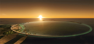
There are two projects by the same architect as this scheme on one of the other pages, located there because of their relevance to the development of residential housing. Here the project is for a spa to be located on a part of the north shores of the peninsula and illustrates something of the scale of such projects with their conflict between the diminishing areas of unspoilt land for development and the perceptions of developers for opportunities in line with Qatar’s stated National Vision for 2030.
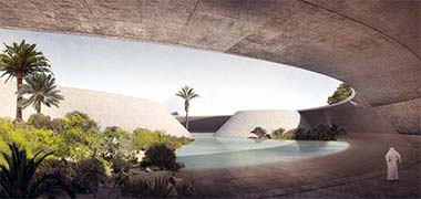

The aerial view above shows the insertion of a crescent development onto the shore line, drawing in and enclosing a part of the sea within an important Islamic geometric symbol. A variety of enclosed and open architectural elements would provide shelter and protection for those enjoying and working in the spa. In this there is little difference between this project and many of the other commercial operations developed around the country. The second and third illustrations show the character suggested for some of the enclosed areas of the spa with water and soft planting established in contemplative rather than activity-oriented groupings, and backed by significant areas of hard sloped banks, mushrabiya or brise soleil providing varying degrees of privacy and air-flow.
But around the encircling crescent a range of opportunities are provided to reinforce the visual links between land and sea, the horizon again creating a focus for the contemplative nature of those using the spa. However, a small marina is part of the development and this would militate against relaxation, there being a significant dichotomy between reflective or contemplative needs and marine and other activities or pursuits, as has been demonstrated elsewhere.
While it appears that it is possible to discern the geometry of the enclosing crescent from both the higher levels of the project as well as the crescent itself, it would be interesting to learn of its orientation and the attitude of some towards it; two-dimensional geometries can create difficulties with unforeseen interpretation.
There are more developments discussed on the planning page.
Search the Islamic design study pages
- Introduction
- Arabic / Islamic design
- Arabic / Islamic geometry 01
- Arabic / Islamic geometry 02
- Arabic / Islamic geometry 03
- Arabic / Islamic geometry 04
- Islamic architecture
- Islamic urban design 01
- Islamic urban design 02
- Islamic urban design 03
- Islamic urban design 04
- Islamic urban design 05
- Arabic / Islamic gardens
- Gulf architecture 01
- Gulf architecture 02
- Gulf architecture 03
- Gulf architecture 04
- Gulf architecture 05
- Gulf architecture 06
- Gulf architecture 07
- Gulf architecture 08
- Infrastructure development
- The building industry
- Environmental control
- Perception
- The household on its lot
- A new approach – conceptual
- A new approach – principles
- A new approach – details
- Al Salata al jadida
- Public housing
- Expatriate housing study
- Apartment housing
- Pressures for change
- The State’s administration
- Society 01
- Society 02
- Society 03
- Society 04
- Society 05
- Society 06
- History of the peninsula
- Geography
- Planning 01
- Planning 02
- Population
- Traditional boats
- Boat types
- Old Qatar 01
- Old Qatar 02
- Security
- Protection
- Design brief
- Design elements
- Building regulations
- Glossary
- Glossary addendum
- References
- References addendum
- Links to other sites